Memphis
- Memphis Group
- 80s postmodern
- Memphis Milano
Squiggles, confetti, clashing pastels and shapes that have no job.
Opens an image model with the prompt in it. The price is on the page before you sign in.
What it is for
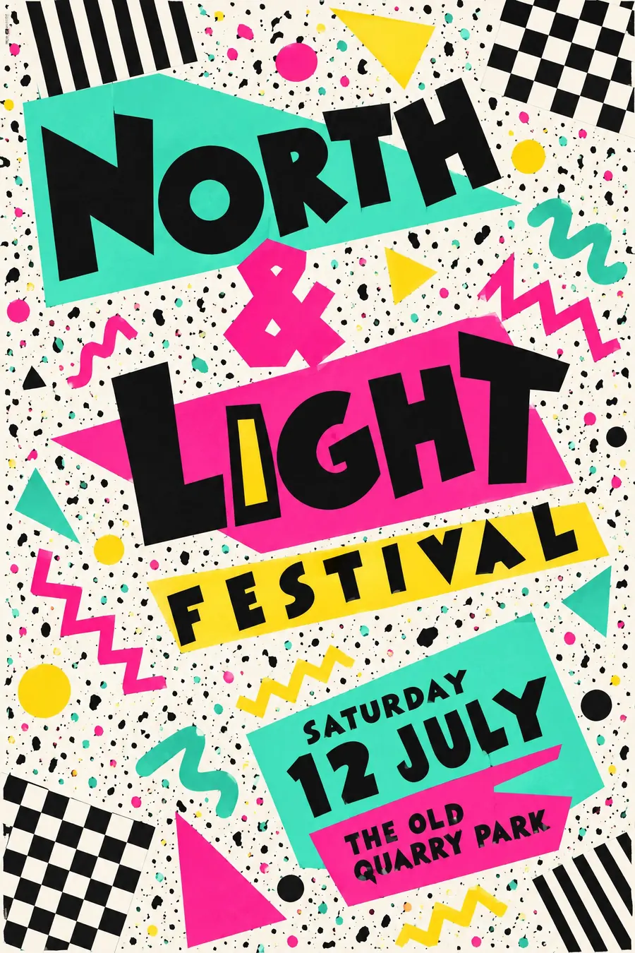
Memphis is design refusing to be serious. Every shape is decoration with no function, which was the whole argument against the modernists.
On a poster it reads as fun without reading as childish, and it is loud enough to survive a noisy wall.
How it works
Scatter the confetti: squiggles, zigzags, half-circles, dots and short bars, floating with no alignment.
Use terrazzo speckle as a background texture on at least one block, and black-and-white stripes or checks on another.
Clash the palette on purpose: mint against hot pink, yellow against turquoise, with black to hold it together. Type is chunky and geometric, tilted a few degrees, sometimes with a shadow offset in a clashing colour.
When to use it
Use it for a roller disco, a school disco, an 80s night, a kids club, an ice cream launch, a craft fair that wants to be loud.
Leave it alone for anything sombre or premium. It cannot be dignified and it will not try.
Told apart from its neighbours
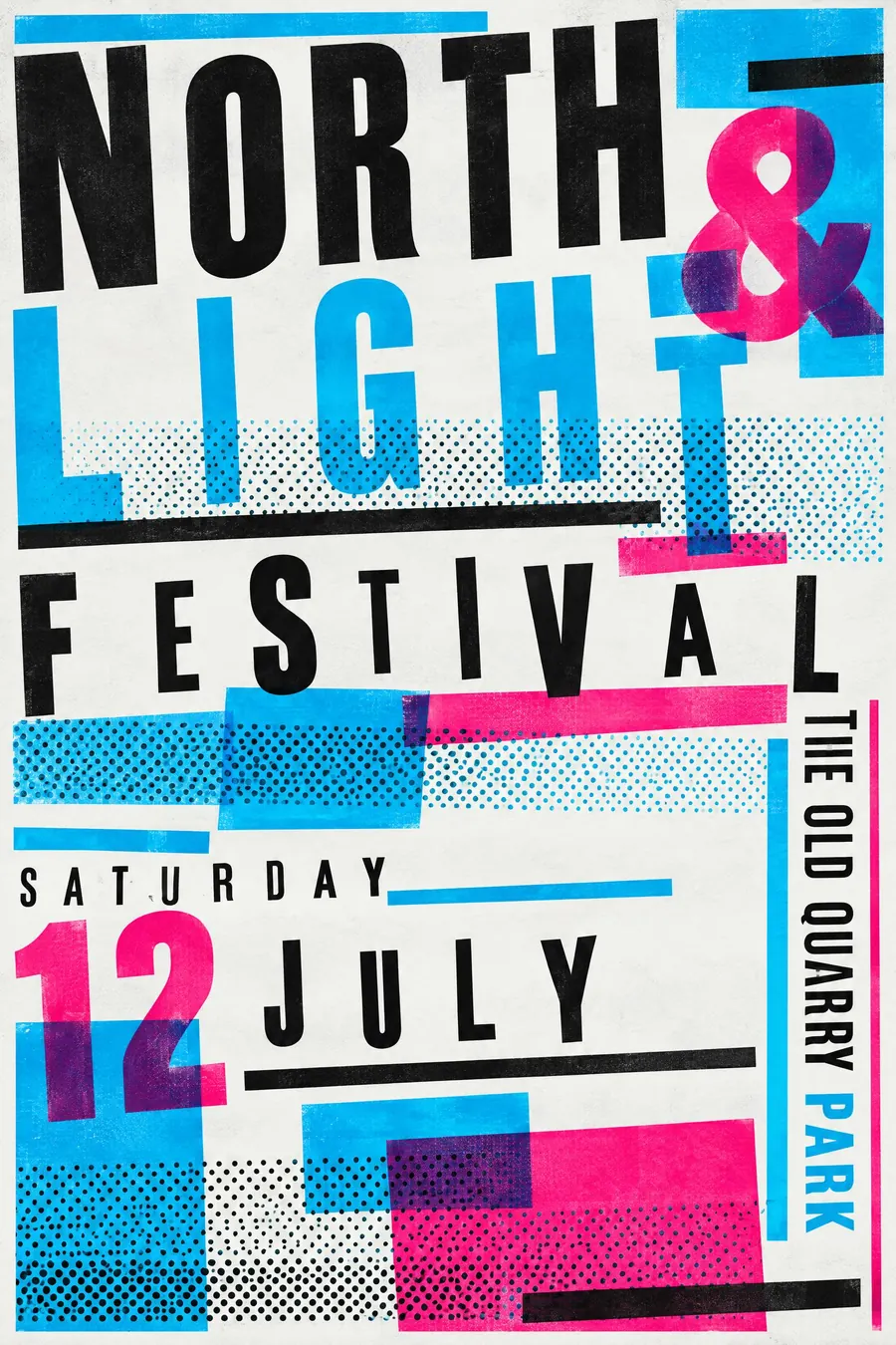
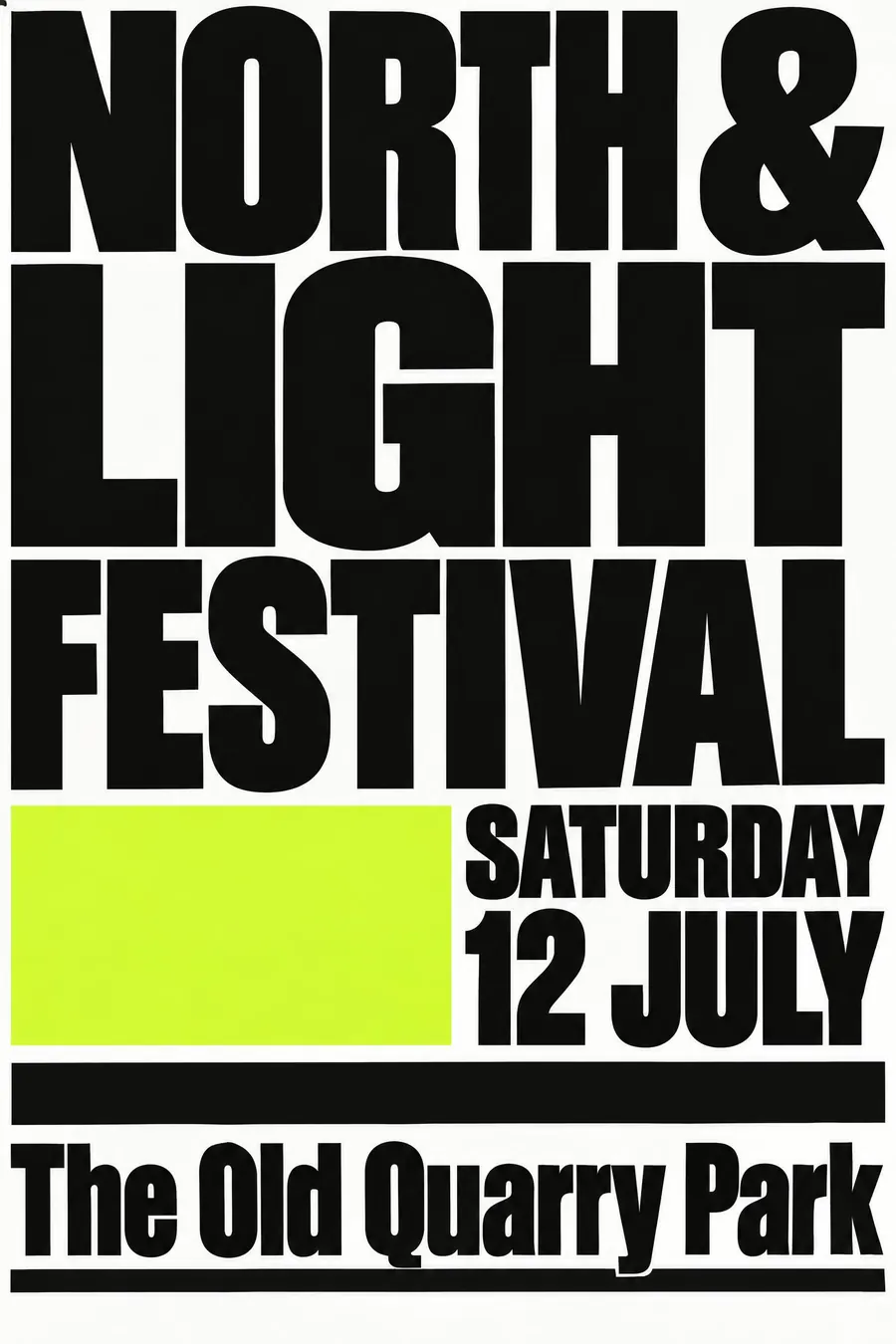
New Wave typography breaks the grid with type and rules rather than with squiggles, and it stays much more typographic.
Y2K chrome shares the optimism but renders everything in glossy metal and blue. Memphis is flat.
Pop art uses recognisable commercial images. Memphis uses shapes that mean nothing at all.
Where it was used
Ettore Sottsass founded the Memphis Group in Milan in 1981, with Nathalie Du Pasquier drawing most of the patterns. The look escaped furniture immediately and ended up on Swatch watches, Saved by the Bell titles and every paper cup of the decade.
- Ettore Sottsass
- Nathalie Du Pasquier
- Saved by the Bell
The prompt
Replace the blanks with your own event, keep the rest. Then run it on an image model.
poster for <event>, Memphis Milano 1980s postmodern style, scattered geometric confetti of squiggles zigzags and dots, terrazzo speckle pattern, clashing palette of mint turquoise hot pink black and yellow, black-and-white striped and checkered blocks, chunky geometric type at odd angles, deliberately unbalanced layout, <date, time and place> on a coloured slab
What goes wrong
The model returns tidy 80s retro with a nice matching palette. Say the colours clash on purpose: mint against hot pink, yellow against turquoise.
The second failure is a symmetrical arrangement of the shapes. Ask for scattered confetti with no alignment and a deliberately unbalanced layout.
Leave out
harmony, muted colour, symmetry, gradients, realism
Watch for
The clash is intentional. Colours that go together nicely turn it into generic 80s nostalgia.
Questions
Print it
Pay for the one run. No subscription, and the price is on the model page before you sign in.
Next to it in the revolt against the grid