Contemporary Editorial
- magazine style
- weekend supplement
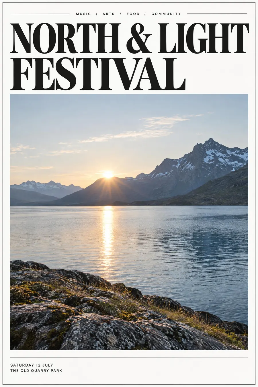
A big elegant serif headline, one full-bleed photograph, and a lot of air.
Opens an image model with the prompt in it. The price is on the page before you sign in.
What it is for
Editorial layout borrows credibility from magazines. A big serif and a photograph read as a feature rather than an advert, and readers trust features.
It also makes an ordinary event look expensive for free. The only asset it needs is one decent photograph.
How it works
Set the headline enormous, in a high-contrast serif, tight tracking, two lines maximum. It should take a third of the sheet.
One photograph, full bleed or in a clean rectangle, and nothing layered on top of it except perhaps the kicker.
Add a small all-caps sans kicker above the headline, hairline rules to separate blocks, and keep the margins wide. Two typefaces total: one serif, one sans.
When to use it
Use it for a supper club, a talk, a gallery, a wine tasting, a wedding fair, a premium product, anything that wants to read grown-up.
Leave it alone for a children's event or a jumble sale. It reads aloof, and it needs a good photograph that most small events do not have.
Told apart from its neighbours
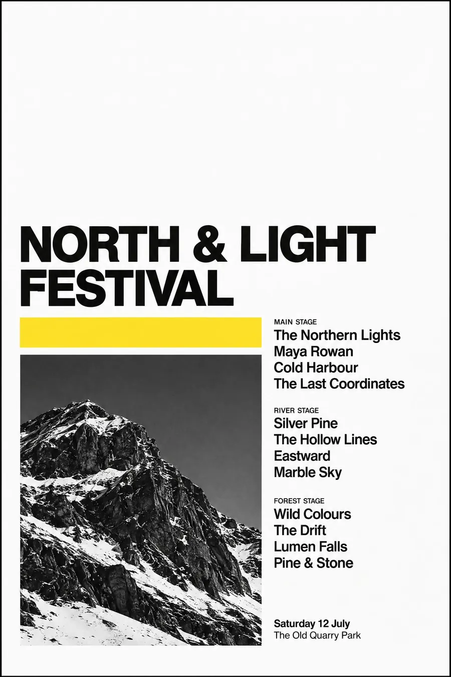
Swiss Style bans the serif and keeps everything flush left on a visible grid. Editorial allows the serif and loosens the grid for effect.
Monochrome plus a single accent drops the photograph entirely and relies on type alone.
Japanese minimal leaves far more empty space and uses a much smaller headline.
- Swiss Style
- Monochrome + Single Accent
- Japanese Minimal Poster
Where it was used
Alexey Brodovitch's Harper's Bazaar spreads from 1934 to 1958 set the rules that magazines still use. The current version is easiest to see in The Gentlewoman and Kinfolk, where a single image and one very large serif do the whole page.
- Harper's Bazaar under Brodovitch
- Kinfolk
- The Gentlewoman
The prompt
Replace the blanks with your own event, keep the rest. Then run it on an image model.
poster for <event>, contemporary editorial magazine style, very large high-contrast serif headline set tight across two lines, one full-bleed photograph, thin hairline rules, a small all-caps sans kicker above the headline, generous white margins, neutral palette with one restrained accent, <date, time and place> in a small sans block aligned to the bottom left
What goes wrong
The model returns a timid headline. Say the headline is very large, tightly tracked, and fills a third of the sheet.
The other failure is text laid over a busy photograph. Ask for either a full-bleed image with the type in a clear margin, or a clean rectangle of image with the type outside it.
Leave out
clipart, drop shadows, gradients, busy background, more than two typefaces
Watch for
The headline has to be genuinely large. Half measures read as a flyer, not an editorial page.
Questions
Print it
Pay for the one run. No subscription, and the price is on the model page before you sign in.