Vienna Secession
- Wiener Werkstatte
- Secessionstil
Art Nouveau squared off: grids of small squares, gold, and severe drawn capitals.
Opens an image model with the prompt in it. The price is on the page before you sign in.
What it is for
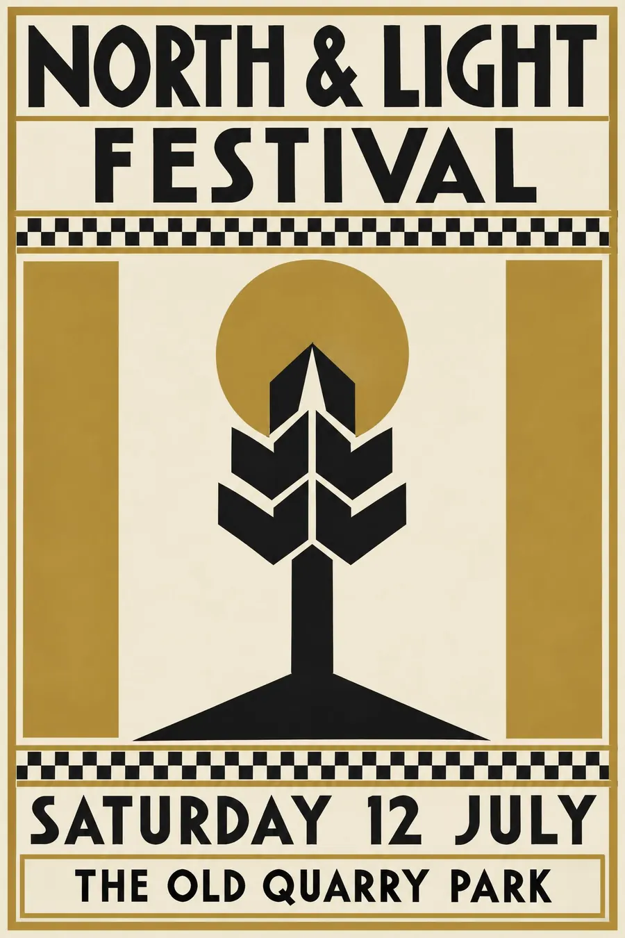
Secession is the point where ornament met the ruler. It keeps the richness of Art Nouveau and the gold leaf, but every shape is set on a square grid, so the poster reads as expensive and controlled at the same time.
That combination is rare and is why it still looks modern. Most decorative styles read as soft. This one reads as disciplined.
How it works
Set a visible rectangular grid and hang everything off it. Bands of small squares, checkerboards and ruled boxes do the decorating that a curve would do elsewhere.
Keep the palette to three: black, gold and cream, with one accent if it must. Flat, no gradients, and the gold is a flat ochre rather than a metallic sheen.
The lettering is drawn, geometric and severe, with square counters and very tight spacing, set in a solid block rather than curved. Leave a wide empty margin around the whole thing.
When to use it
Use it for an exhibition, a recital, a gallery opening, a design show, anything that wants to look curated rather than friendly.
Leave it alone for a family event. The severity reads as cold, and the tight lettering is slow to read at a distance.
Told apart from its neighbours
Art Nouveau curves. Secession is the same movement after it decided curves were undisciplined, so the test is simple: any whiplash line and you are back in Nouveau.
Glasgow Style shares the tall verticals and the restraint but keeps a few long organic stems and a lot more white. Secession fills the grid.
Where it was used
Koloman Moser designed the Secession exhibition posters and the Ver Sacrum covers, and squared everything the Viennese had learned from Paris. Gustav Klimt's 1898 poster for the first Secession exhibition is the founding sheet, and the Wiener Werkstatte carried the same square grid onto furniture, metalwork and packaging.
- Koloman Moser
- Gustav Klimt
- Ver Sacrum
The prompt
Replace the blanks with your own event, keep the rest. Then run it on an image model.
poster for <event>, Vienna Secession style, strict rectangular grid with a checkerboard band of small squares, flat gold black and cream, one stylised geometric figure or tree, severe hand-drawn capitals set in a rigid block, generous empty margin, <date, time and place> in a ruled box at the foot
What goes wrong
The model returns Klimt: gold spirals, a robed figure, mosaic texture. Ask for the graphic side, a flat grid of small squares, ruled boxes and drawn capitals, and say no mosaic and no painted figure.
The second failure is the gold turning metallic and glossy. Say flat ochre gold with no sheen and no gradient.
Leave out
curving whiplash lines, soft shading, photographic texture
Watch for
The grid of small squares is the tell. Take it out and it reads as generic deco.
Questions
Print it
Pay for the one run. No subscription, and the price is on the model page before you sign in.