Grunge Typography
- Ray Gun style
- 90s grunge design
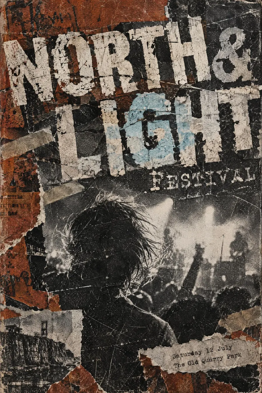
Layered dirt, damaged letterforms and text that fights the image.
Opens an image model with the prompt in it. The price is on the page before you sign in.
What it is for
Grunge design treats legibility as optional and atmosphere as compulsory. It was a reaction to a decade of clean corporate layout, and it still reads as anti-corporate.
The damage also implies history. A poster that looks photocopied five times reads as something that has been passed around.
How it works
Layer. Photocopy texture over film grain over a halftone photograph, each layer slightly misaligned.
Damage the letters: broken edges, missing counters, letters overlapping each other and running off the sheet.
Mix typefaces that should not meet, and let type cross the image rather than sit beside it. Keep the palette muddy: rust, grey, black, one bleached colour. Then set the practical details in small clean typewriter text so the poster still works.
When to use it
Use it for a rock night, a skate event, a record shop, a zine fair, a student night, a film season with an edge.
Leave it alone for anything official or anything an older audience must read. It is genuinely harder to read and that is the point.
Told apart from its neighbours
Punk fanzine style is cruder: a real photocopier, ransom-note lettering, no layering. Grunge is designed dirt.
New Wave breaks the grid cleanly with geometry. Grunge breaks it with texture and damage.
Glitch art is the digital version, with RGB channel shift and scan lines rather than toner and grain.
Where it was used
David Carson art directed Ray Gun from 1992 and once set an entire interview in Zapf Dingbats. Neville Brody had already pushed the same argument at The Face in the 1980s, and the look spread through skate and snowboard graphics for the rest of the decade.
- David Carson
- Ray Gun magazine
- Neville Brody
The prompt
Replace the blanks with your own event, keep the rest. Then run it on an image model.
poster for <event>, 1990s grunge typography, layered photocopied textures and scratched film grain, distressed damaged letterforms with broken edges, text overlapping a high-contrast photograph, mixed typefaces colliding, torn paper and tape fragments, muddy palette of rust grey and black with one bleached colour, headline partly obscured on purpose, <date, time and place> in small typewriter text
What goes wrong
The model returns a clean poster with a grain filter over it. Ask for layered misaligned textures, damaged letterforms with broken edges and type crossing the image.
The second failure is total illegibility. Say one line, the date and place, stays clean and readable in small typewriter text.
Leave out
clean edges, white space, alignment, bright clean colour
Watch for
Legibility is traded away deliberately. Keep one line clean or nobody learns the date.
Questions
Print it
Pay for the one run. No subscription, and the price is on the model page before you sign in.
Next to it in the revolt against the grid