New Wave Typography
- Swiss punk
- Weingart style
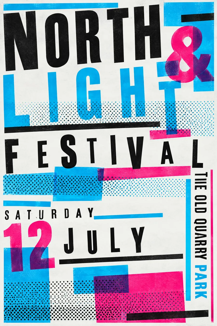
The Swiss grid taken apart: letterspaced words, stepped rules and type at angles.
Opens an image model with the prompt in it. The price is on the page before you sign in.
What it is for
New Wave is what happens when somebody who has mastered the Swiss grid decides to disobey it. The tension between the discipline and the disobedience is the whole appeal.
It reads as intelligent and current in a way that pure chaos never does, because every broken rule was clearly a rule first.
How it works
Letterspace a word until it stretches across the sheet, then set the next line tight. The contrast between the two is the composition.
Step the rules: several horizontal lines of different thickness, staggered rather than aligned. Add halftone dot bands as texture.
Change size and weight inside a single line. Overlap layers with transparency so type shows through shapes. Keep the palette cold: black, cyan, one hot accent.
When to use it
Use it for a club night, a design lecture, a record label, a student show, an experimental music series.
Leave it alone when the audience is general. It is a designer's style and it looks like a mistake to people who do not read it as one.
Told apart from its neighbours
Swiss Style is the thing being broken. If everything aligns, you are back in Swiss.
Grunge typography breaks type with dirt, photocopies and torn edges. New Wave breaks it with geometry and spacing, and stays clean.
Designers Republic is the 1990s digital heir, with numbers, warning symbols and pseudo-corporate marks added.
Where it was used
Wolfgang Weingart taught at Basel from 1968 and spent twenty years pulling the Swiss grid apart in front of his students. April Greiman took it to California and added the computer, and her 1986 Design Quarterly issue, a life-size digital self-portrait, is the moment the style went digital.
- Wolfgang Weingart
- April Greiman
- Dan Friedman
The prompt
Replace the blanks with your own event, keep the rest. Then run it on an image model.
poster for <event>, New Wave Swiss punk typography, the grid deliberately broken, words letterspaced far apart, type set in several sizes and weights within one line, stepped and staggered rules of varying thickness, halftone dot bands, limited palette of black cyan and one hot accent, layers overlapping with transparency, <date, time and place> set vertically along one edge
What goes wrong
The model returns an unreadable mess. Say it stays legible, with a clear hierarchy, and only the alignment is broken.
The second failure is warm colour. Ask for black, cyan and one hot accent, and no muted or earthy tones.
Leave out
neat alignment, ornament, illustration, warm muted colour
Watch for
It must still be readable. Broken is a decision, not a mess.
Questions
Print it
Pay for the one run. No subscription, and the price is on the model page before you sign in.
Next to it in the revolt against the grid