Victorian Broadside
- playbill
- wood type poster
- circus bill
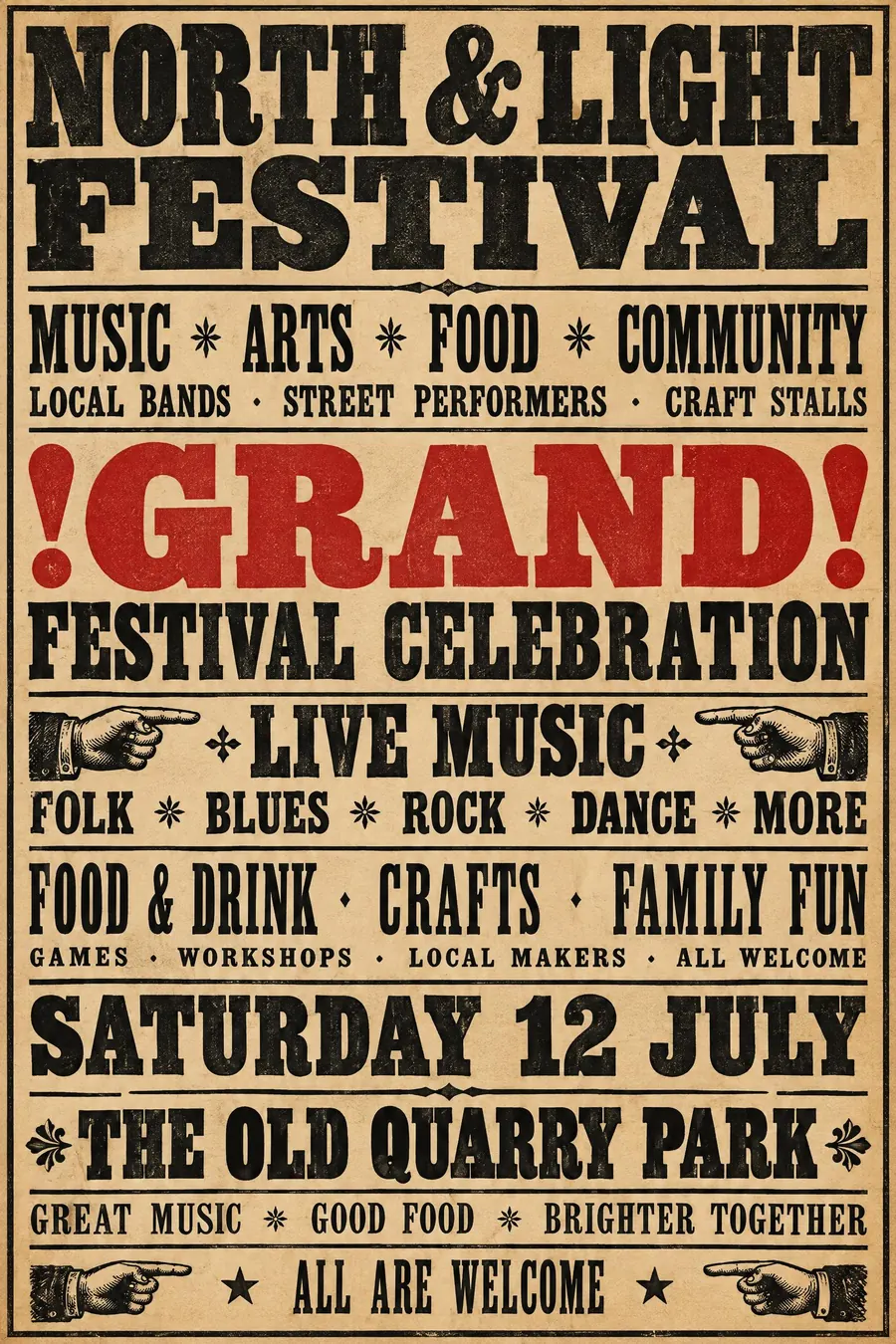
A wall of wood type: every line a different face, every line a different size.
Opens an image model with the prompt in it. The price is on the page before you sign in.
What it is for
A broadside says there is a lot happening and all of it is worth your money. The typographic chaos is the message: abundance.
It is also the honest ancestor of the event poster. Before photography, a poster was words, and this is what words at full volume looked like.
How it works
Fill the sheet. Margins are thin and there is no empty area anywhere.
Change typeface and size on every single line: a fat face, then a condensed grotesque, then a slab serif, then a shadowed display face. Separate them with hairline rules.
Print black on aged buff paper, with one red line for the thing you most want read. Add pointing hands, stars and the vocabulary of the period: GRAND, POSITIVELY, FOR ONE DAY ONLY.
When to use it
Use it for a village fete, a fair, a circus, a bring and buy, a comedy night, a pantomime, anything with a long list of attractions.
Leave it alone when there is one simple thing to say. A broadside with three lines on it looks empty and wrong.
Told apart from its neighbours
Penny dreadful covers add a lurid illustration and a melodramatic scene. A broadside is type alone.
Heavy metal posters inherit the density but centre everything on an illustration.
Golden Age travel posters are the opposite: one image, four words.
Where it was used
Victorian theatre playbills and Barnum's circus bills are the source, printed from wood type because metal that size would have been unliftable. Hatch Show Print in Nashville has been printing the same way since 1879 and still does gig posters with it.
- Victorian theatre playbills
- Barnum circus bills
- Hatch Show Print
The prompt
Replace the blanks with your own event, keep the rest. Then run it on an image model.
poster for <event>, Victorian broadside playbill, the whole sheet filled with letterpress wood type, every line a different typeface and size, fat faces slab serifs and condensed grotesques stacked with hairline rules between, pointing hand ornaments, black ink on aged buff paper with one red line, exclamation marks and the word GRAND, <date, time and place> set as its own emphatic line
What goes wrong
The model returns a tidy poster in one ornate typeface. Say every line uses a different typeface and a different size, with hairline rules between them.
The other failure is clean white paper. Ask for aged buff stock, uneven ink coverage and visible letterpress impression.
Leave out
white space, photographs, sans-serif minimalism, modern kerning
Watch for
Every line must be a different size. Uniform lines turn it into a modern pastiche.
Questions
Print it
Pay for the one run. No subscription, and the price is on the model page before you sign in.
Next to it in before the break