CoBrA
- Cobra group
- Appel style
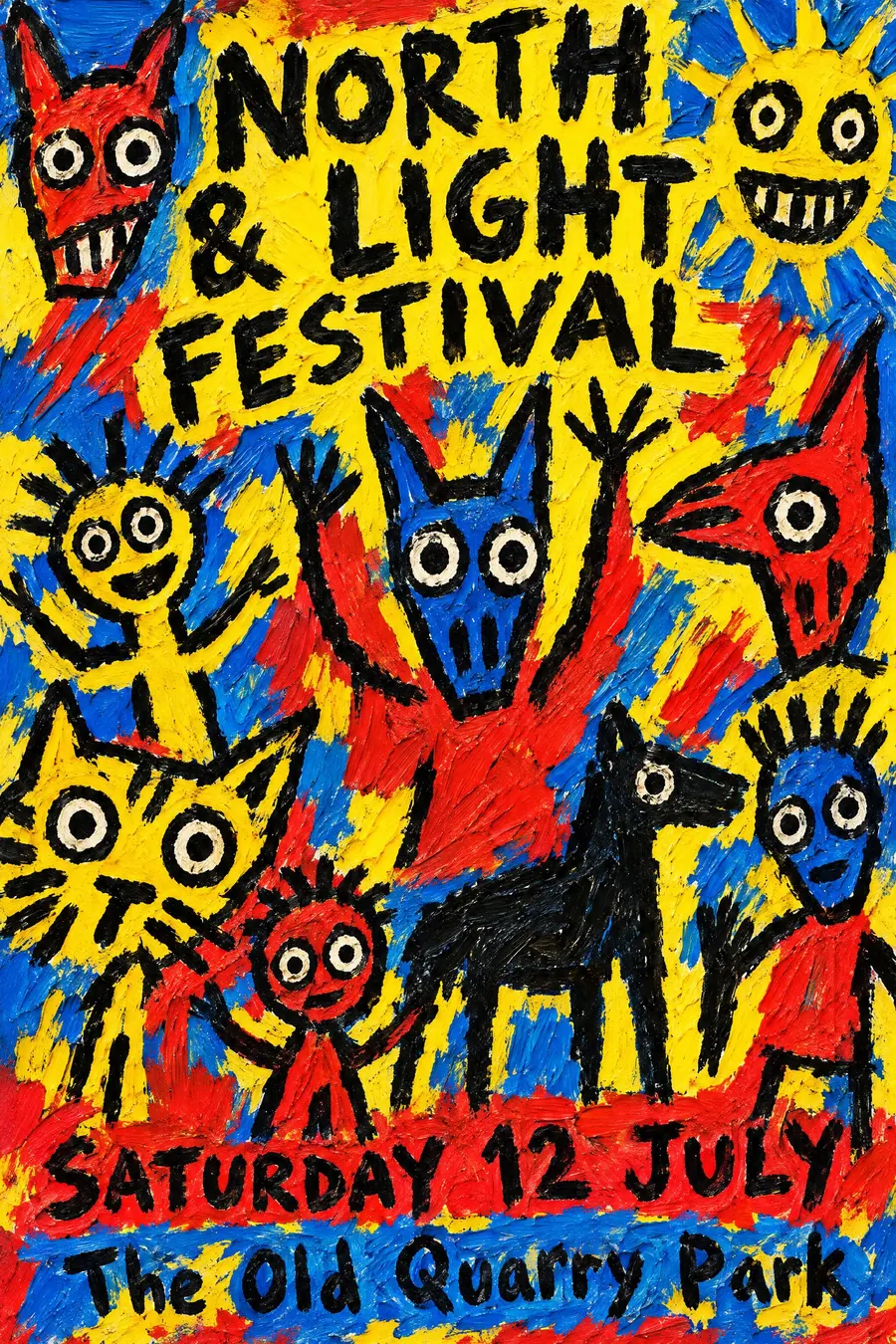
Thick raw brushwork, bright colour and figures drawn like a child would draw them.
Opens an image model with the prompt in it. The price is on the page before you sign in.
What it is for
CoBrA took children's drawing and folk art seriously as a way out of European formalism. The result is joyful, loud and completely unpretentious.
On a poster it reads as a community event made by people rather than by an agency, which is often exactly right.
How it works
Paint thick. Visible bristle marks, ridges of paint, colour applied straight from the tube and not mixed on the palette.
Draw the figures crudely in a heavy black line: round staring eyes, animal masks, birds, simplified bodies. Confident and fast.
Fill the sheet, no empty space, no plan. The lettering is hand painted and uneven, part of the same gesture as the picture.
When to use it
Use it for a community festival, a children's art event, a jazz or free improvisation gig, a school fair, a mural project.
Leave it alone for anything formal or premium. It looks like a party invitation whatever you write on it.
Told apart from its neighbours
Child poster paint with professional typography is a deliberate contrast between crude image and sharp type. CoBrA paints the type too.
Crayon folk handmade is genuinely naive. CoBrA is trained painters choosing to paint that way.
Graffiti is spray and letterform led. CoBrA is brush and figure led.
- Crayon Folk Handmade
- Child Poster Paint + Pro Typography
- Graffiti / Street Art
Where it was used
CoBrA formed in Paris in 1948 and is named after Copenhagen, Brussels and Amsterdam. Karel Appel, Asger Jorn and Pierre Alechinsky are the best known members, and the group's own journal and exhibition posters are the graphic record.
- Karel Appel
- Asger Jorn
- Pierre Alechinsky
The prompt
Replace the blanks with your own event, keep the rest. Then run it on an image model.
poster for <event>, CoBrA movement style, thick raw impasto brushwork with visible bristle marks, bright primary colour applied straight and unmixed, crude childlike figures and animal masks with round eyes drawn in heavy black line, spontaneous unplanned composition filling the whole sheet, roughly hand-painted uneven lettering, <date, time and place> brushed in at the base
What goes wrong
The model returns a tidy naive illustration. Ask for thick impasto brushwork with visible bristle marks and unmixed colour straight from the tube.
The second failure is empty space. Say the composition fills the whole sheet with no margin.
Leave out
precision, geometry, blending, careful drawing, empty space
Watch for
Childlike, not childish. The brushwork must look confident and fast, not careful.
Questions
Print it
Pay for the one run. No subscription, and the price is on the model page before you sign in.