Dada Collage
- photomontage
- Hannah Hoch style
- anti-art
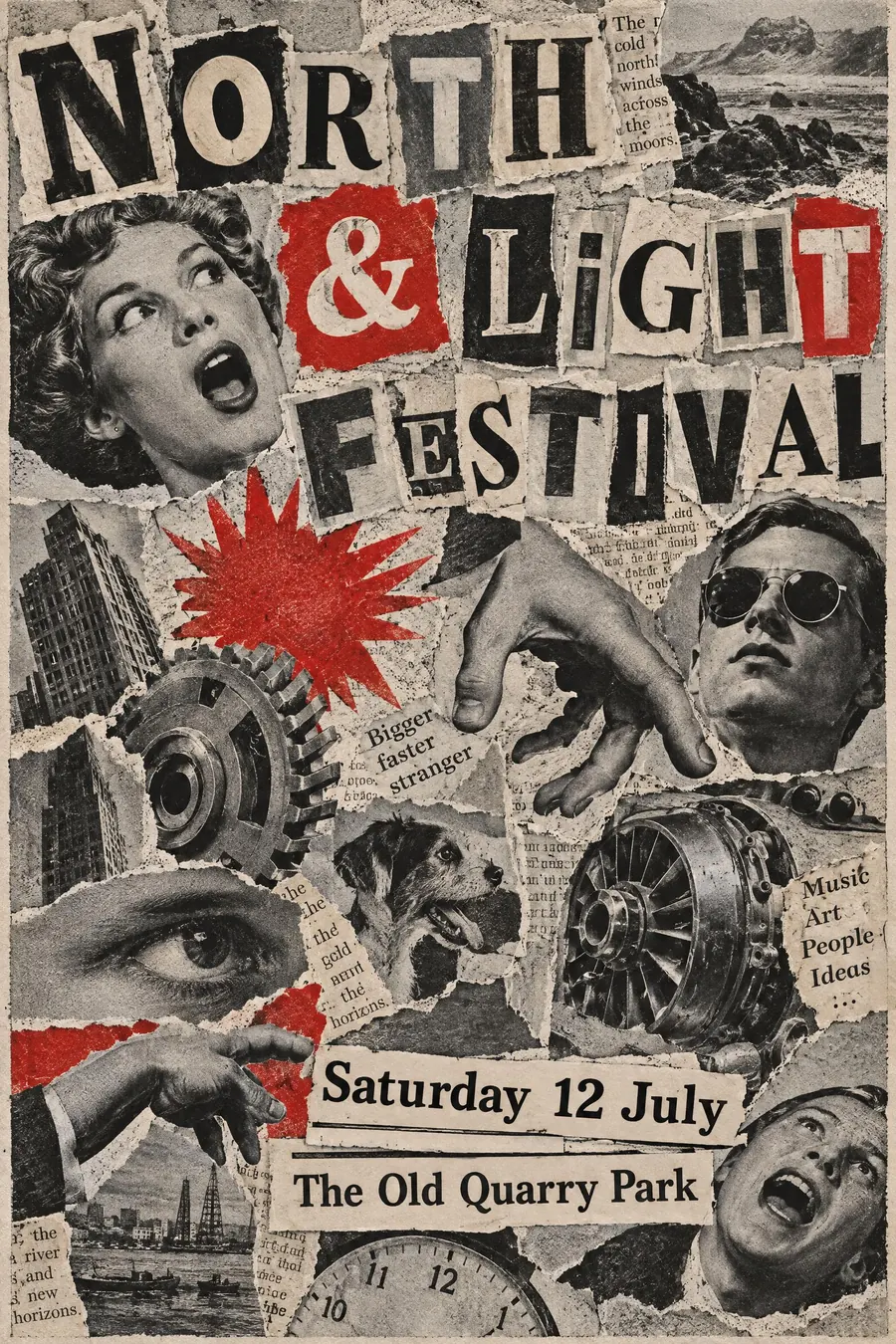
Cut newspaper, mismatched photographs and type at every angle, glued into nonsense.
Opens an image model with the prompt in it. The price is on the page before you sign in.
What it is for
Dada was built to be against things, and collage was the method because it destroys the original meaning of everything it cuts up.
On a poster it reads as funny and unsettling at once, which is a rare combination and very hard to fake any other way.
How it works
Cut, do not blend. Every element keeps a visible white paper edge and a slight drop shadow.
Mismatch the scale on purpose: a tiny body with a huge head, a hand bigger than a building, a machine part where a face should be.
Type is cut from different sources in different sizes, ransom-note style. Palette is newsprint grey, black and one red. Add torn newspaper fragments as texture.
When to use it
Use it for an art show, a protest, a comedy night, a zine fair, an experimental gig, a political meeting.
Leave it alone for anything sincere. Dada undermines whatever it is applied to, including your event.
Told apart from its neighbours
Zine cut-and-paste is the punk descendant, cruder and photocopied rather than carefully composed.
Surrealist collage aims at dream logic and usually keeps one coherent space. Dada refuses coherence entirely.
Constructivist photomontage uses the same scissors with a clear political message and a designed structure.
Where it was used
Hannah Hoch's Cut with the Kitchen Knife of 1919 is the founding collage. Raoul Hausmann and the Berlin Dada group worked the same way, and John Heartfield turned the technique into precise anti-Nazi photomontage for AIZ through the 1930s.
- Hannah Hoch
- Raoul Hausmann
- John Heartfield
The prompt
Replace the blanks with your own event, keep the rest. Then run it on an image model.
poster for <event>, Dada photomontage collage, torn newspaper fragments and cut-out photographic heads at mismatched scales, machine parts and hands glued in at random angles, ransom-note type cut from different newspapers, visible paper edges and shadow, palette of newsprint grey black and one red, deliberate nonsense juxtaposition, <date, time and place> cut from a printed timetable and pasted in
What goes wrong
The model returns a smooth digital composite. Ask for visible cut paper edges, slight drop shadows and mismatched print quality between fragments.
The second failure is a tidy grid of images. Say the fragments sit at random angles at mismatched scales.
Leave out
harmony, alignment, digital smoothness, consistent scale
Watch for
The scale mismatch is the joke. Heads the right size for their bodies kills it.
Questions
Print it
Pay for the one run. No subscription, and the price is on the model page before you sign in.
Next to it in the avant-garde shouts