Crayon Folk Handmade
- wax crayon
- naive drawing
- felt tip poster
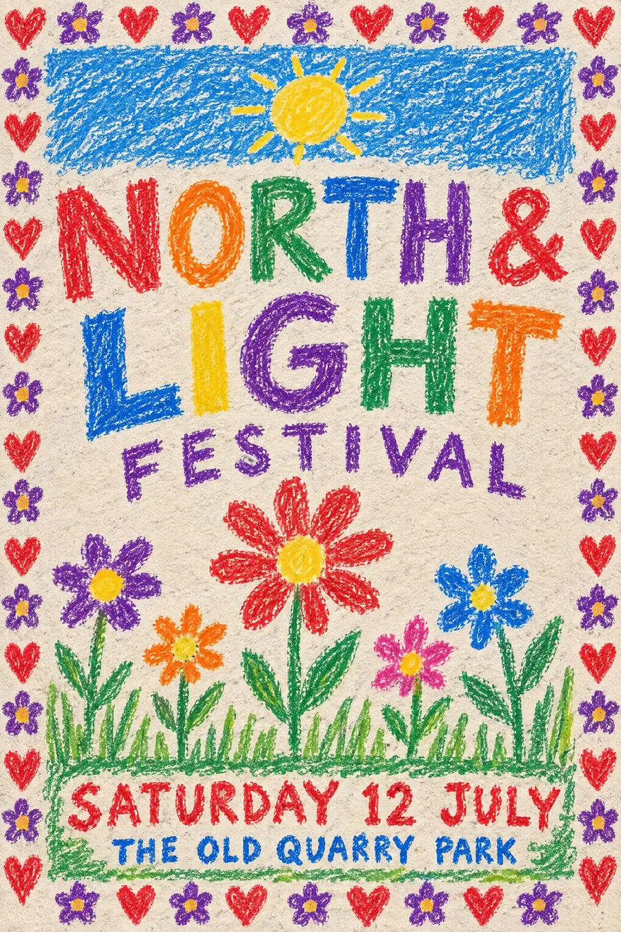
Wax crayon on rough paper, drawn by somebody who is not a drawer.
Opens an image model with the prompt in it. The price is on the page before you sign in.
What it is for
This is what a real handmade poster looks like, and everybody has seen a hundred of them in a shop window. The familiarity is the whole asset.
It also reads as urgent and personal. Somebody sat down and drew this, which for a small event is the most honest thing the poster can say.
How it works
Draw in wax crayon on rough paper so the grain breaks up every stroke. Colour goes past the outlines in places and leaves gaps in others.
Refuse perspective. Sky is a band along the top, ground is a band along the bottom, and everything else sits in between at roughly the same size.
Hand print the capitals in felt tip and let them get smaller when the line runs out of room. Add a border of repeated hearts, flowers or stars.
When to use it
Use it for a village hall event, a jumble sale, a coffee morning, a lost pet appeal, a scout group, a charity shop opening, a street party.
Leave it alone when you need to look organised. The style says small and local, which is only sometimes what you want.
Told apart from its neighbours
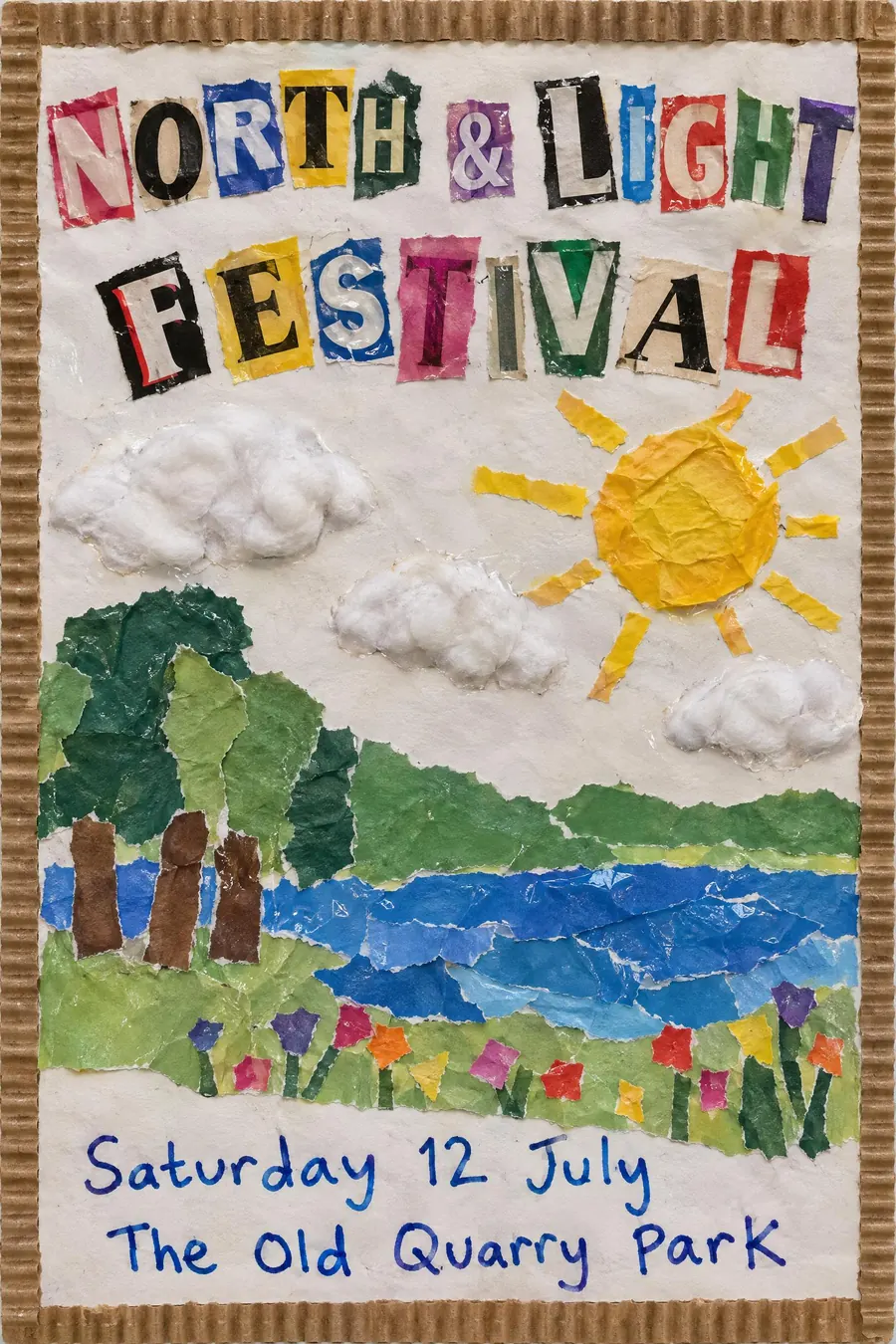
School cutout collage is stuck down rather than drawn, and is clearly a classroom activity.
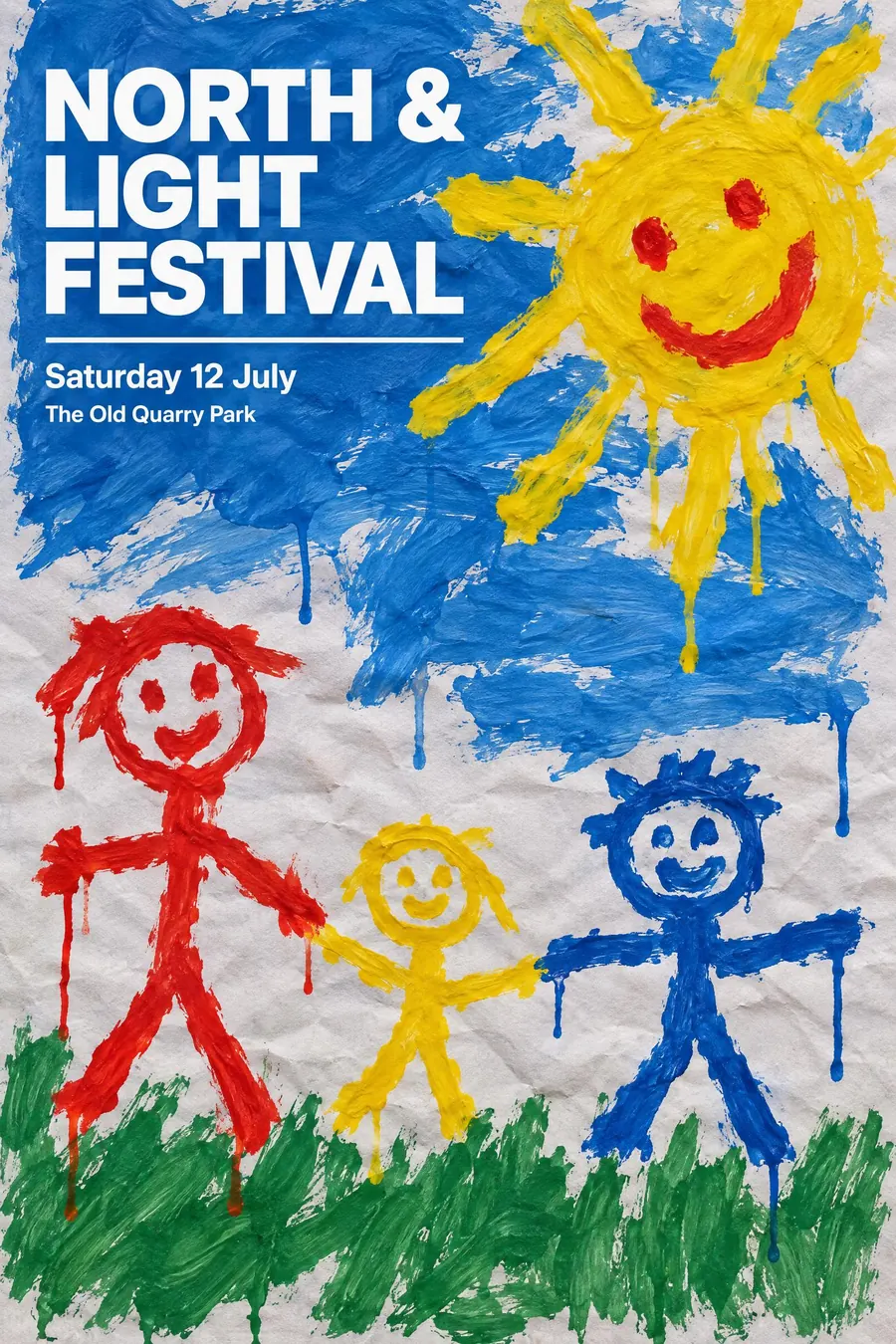
Child paint with professional typography keeps the drawing naive and makes the type expert. Here everything is naive.
CoBrA is a trained painter imitating this on canvas, at scale, in oil.
Where it was used
Village notice boards, corner shop windows and lamp posts are the gallery. The lost cat poster is the purest form of the genre, and the one everybody stops to read.
- village notice boards
- lost cat posters
- charity shop windows
The prompt
Replace the blanks with your own event, keep the rest. Then run it on an image model.
poster for <event>, wax crayon drawing on rough off-white paper, waxy uneven strokes with the paper grain showing through, colour scribbled in past the outlines and gaps left in the middle, a naive drawing with no perspective where the sky is a band at the top and the ground a band at the base, hand-printed capitals in felt tip that get smaller as the line runs out of room, a decorated border of repeated hearts and flowers, <date, time and place> squeezed in at the bottom
What goes wrong
The model returns a polished illustration in a cute style. Ask for waxy uneven crayon strokes with the paper grain showing and colour going past the outlines.
The second failure is neat hand lettering. Say the letters are hand printed in felt tip and get smaller as the line runs out of room.
Leave out
shading, perspective, even colour, digital line, professional lettering
Watch for
Let the lettering run out of room. Perfectly fitted hand lettering reads as a font.
Questions
Print it
Pay for the one run. No subscription, and the price is on the model page before you sign in.