Child Paint with Pro Typography
- kid art poster
- school painting with designer type
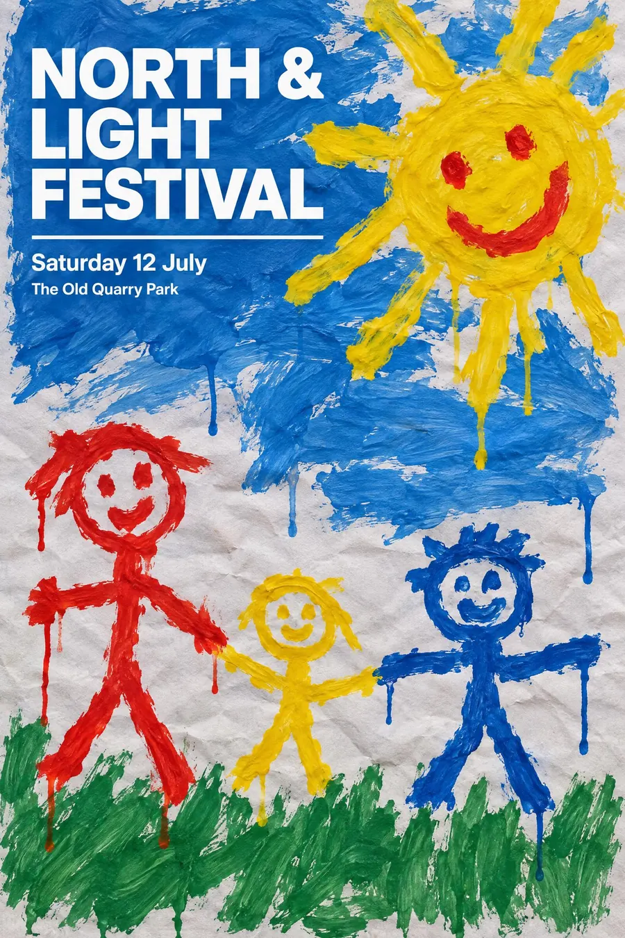
A genuine child's poster paint picture, with sharp professional typography laid over it.
Opens an image model with the prompt in it. The price is on the page before you sign in.
What it is for
Two registers on one sheet is the trick. The painting supplies warmth and the typography supplies competence, and neither could do the job alone.
It also disarms people. A child's painting says the event is not trying to sell you anything, and the clean type says somebody nevertheless took care.
How it works
The painting must look real: thick unmixed poster paint, clumsy brush strokes, paint running where it was too wet, and the sugar paper buckling under it.
Photograph it flat rather than rendering it. The visible paper texture is what separates this from a digital brush effect.
Then set the type with complete precision: one crisp grotesque, flush left, perfect spacing, two sizes, a thin rule. Nothing decorative, nothing that tries to match the painting.
When to use it
Use it for a school fair, a nursery open day, a children's charity, a family festival, a community fundraiser, a playgroup.
Leave it alone for anything premium. The painting reads as amateur and it is meant to.
Told apart from its neighbours
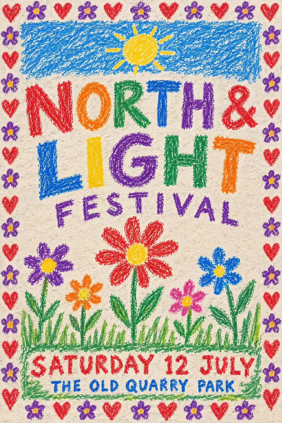
Crayon folk handmade keeps everything in the same register, including the lettering. Here the type is deliberately from another world.
CoBrA is trained painters imitating a child. This is an actual child's painting.
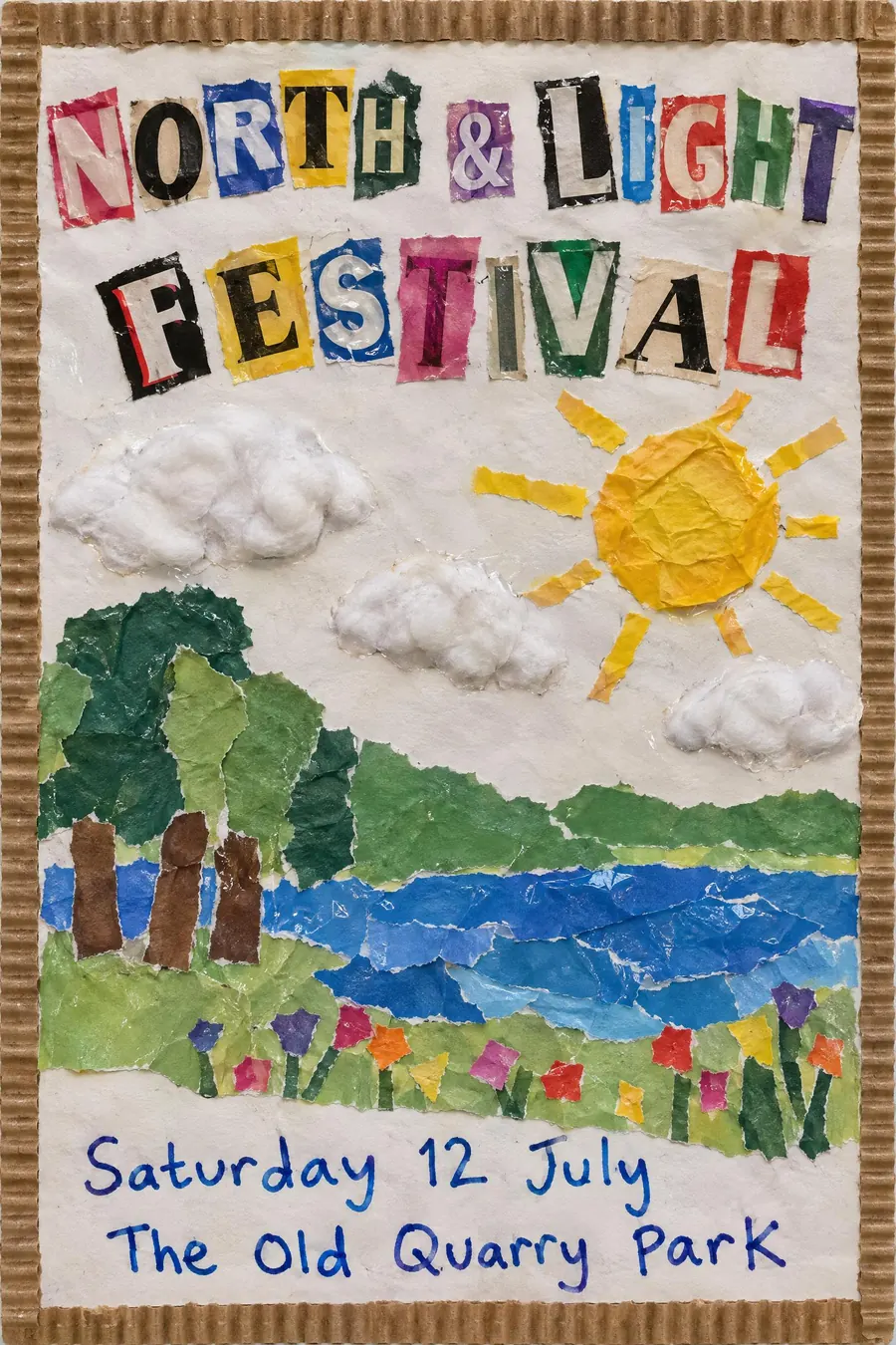
School cutout collage uses torn paper rather than paint.
Where it was used
Charity campaigns use the pairing constantly because it reads as authentic and organised at once. Album artwork has borrowed it since at least the 1990s, and school hall displays are the unselfconscious original.
- school hall displays
- charity campaign posters
- album artwork
The prompt
Replace the blanks with your own event, keep the rest. Then run it on an image model.
poster for <event>, a child's poster paint painting on sugar paper photographed flat, thick clumsy brush strokes in unmixed primary paint, a wobbly sun and stick figures with the paint running where it was too wet, visible paper buckling, then precise modern typography set over it in a crisp flush-left grotesque with perfect spacing, a thin white rule separating the type block, <date, time and place> in small clean sans at the base
What goes wrong
The model returns a tidy illustration in a childlike style. Ask for thick clumsy unmixed poster paint with runs and buckled sugar paper, photographed flat.
The second failure is playful type. Say the typography is precise modern grotesque, flush left, with perfect spacing and nothing decorative.
Leave out
neat painting, decorative type, drop shadows, digital brushes
Watch for
The contrast is the design. Make the painting genuinely clumsy and the type genuinely sharp.
Questions
Print it
Pay for the one run. No subscription, and the price is on the model page before you sign in.