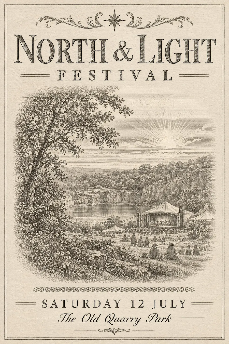
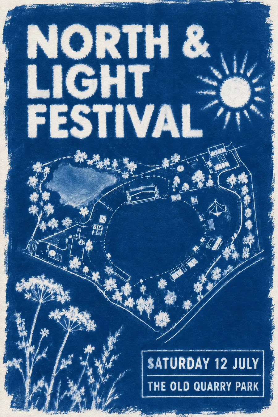
Stamp and Letterpress
- letterpress
- modern letterpress
- postage stamp style
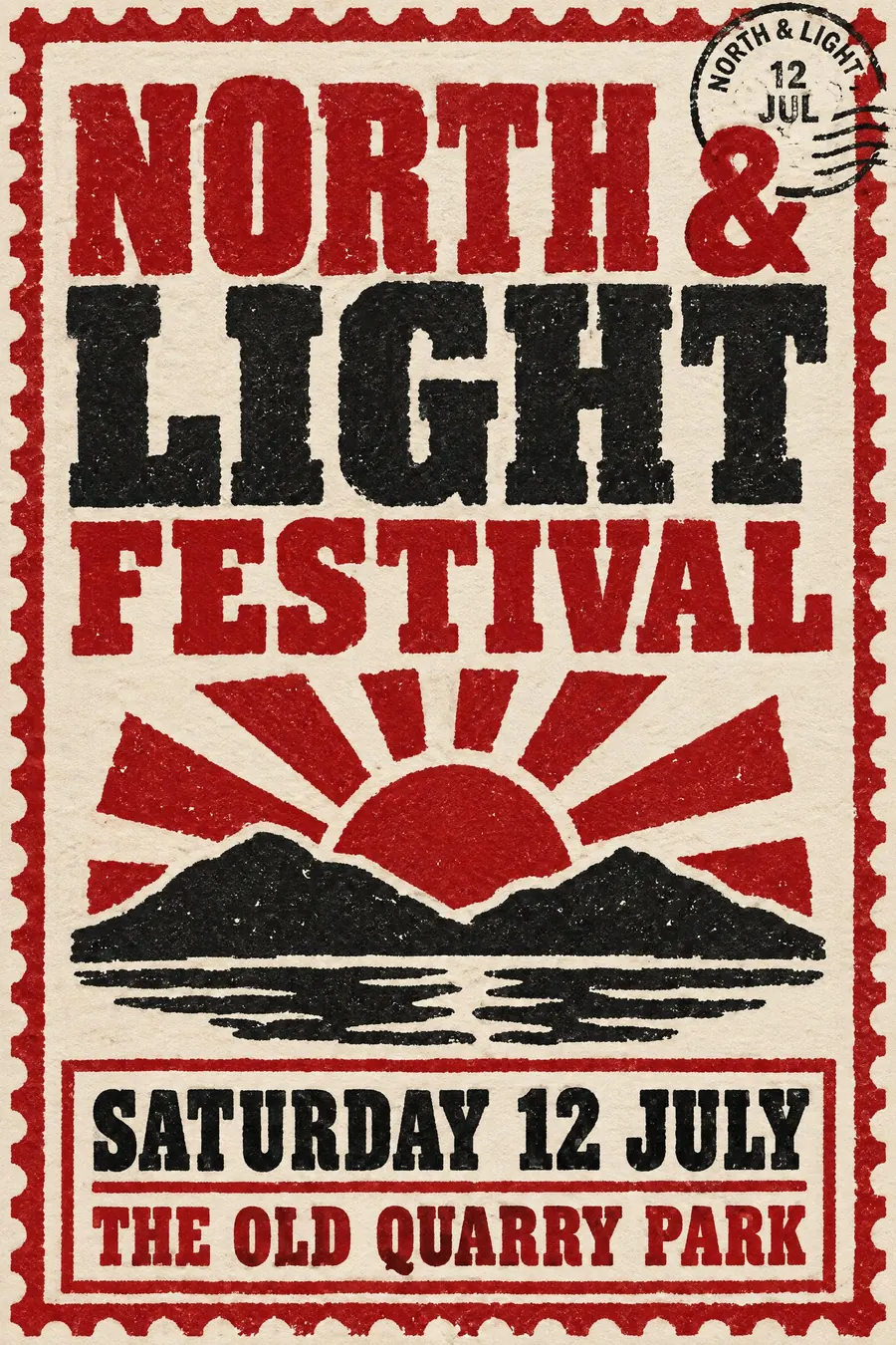
Bold inked shapes with slight imperfections, pressed into thick paper you can feel.
Opens an image model with the prompt in it. The price is on the page before you sign in.
What it is for
Letterpress is the only process that makes paper a texture you can feel, and even in reproduction the shadow in the impression reads as quality.
The stamp framing adds something else: a perforated edge and a postmark make an announcement feel official and collectable at the same time.
How it works
Keep the shapes bold and simple. Thin lines do not survive, so everything is solid and heavy.
Ink imperfectly: slightly ragged edges, tiny gaps in solid areas, and heavier ink where the press bit harder.
Two inks on thick cream cotton paper, with a visible impression around every letter. A perforated stamp border, a scalloped edge and a small circular postmark finish it.
When to use it
Use it for a wedding, a supper club, a book launch, a craft fair, an anniversary, a small brewery, a stationery-adjacent event.
Leave it alone when the poster needs an image. The process is for type and flat shape.
Told apart from its neighbours
Victorian broadside is letterpress too, but chaotic, crowded and printed from wood type at every size. This is the modernised, restrained version.
Screenprint gives thicker ink but no impression, and no deboss in the paper.
Engraving gives fine line detail that letterpress cannot hold.
- Screenprint Pop
- Victorian Broadside
- Etching / Engraving
Where it was used
Hatch Show Print in Nashville is the living tradition, and postage stamp design is where most people see bold two-colour letterpress thinking. The 2000s revival put it on wedding invitations, where the deep impression became the selling point.
- Hatch Show Print
- postage stamp design
- modern wedding stationery
The prompt
Replace the blanks with your own event, keep the rest. Then run it on an image model.
poster for <event>, modernised letterpress print, bold simple shapes inked solid with slightly ragged edges and tiny ink gaps, visible deep impression pressing the type into thick cotton paper, two inks only in deep red and black on cream, a perforated postage stamp border with a scalloped edge, wood type capitals with uneven inking, a small circular postmark overlapping the corner, <date, time and place> in a ruled box
What goes wrong
The model returns a flat digital print. Ask for a visible deep impression pressing the type into thick cotton paper, with a shadow inside each letter.
The second failure is perfectly even ink. Say the inking is slightly uneven with ragged edges and tiny gaps.
Leave out
gloss, gradients, photographs, perfect even ink, thin hairlines
Watch for
The impression is the whole point. Say the type is pressed into the paper, not printed on it.
Questions
Print it
Pay for the one run. No subscription, and the price is on the model page before you sign in.