Risograph
- riso print
- duplicator print
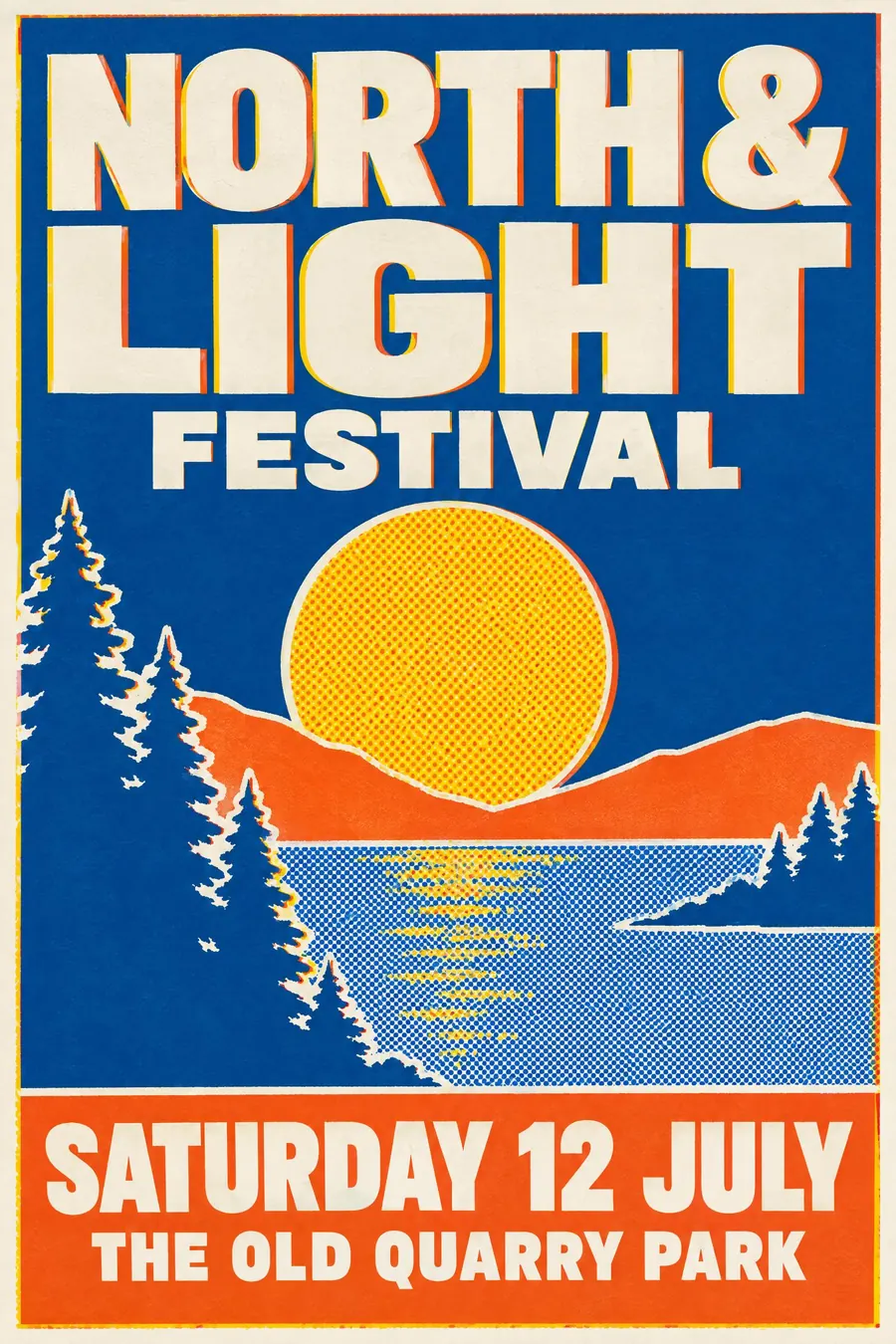
Two or three fluorescent inks, misregistered, with grain and visible overprint.
Opens an image model with the prompt in it. The price is on the page before you sign in.

What it is for
Riso is the default handmade look of the last fifteen years, and for good reason: the fluorescent inks are genuinely brighter than process colour, and the misregistration reads as care rather than error.
It also tells the reader the print run was small. A riso poster looks like one of two hundred, not one of a million.
How it works
Limit to two or three spot inks. Fluorescent pink is the signature, usually with bright blue or yellow.
Offset each layer by a millimetre or two so a coloured fringe shows at every edge. Where two inks overlap they make a third, and that third should be used deliberately.
Add heavy paper grain and mottled, uneven ink coverage. Keep shapes bold and simple, because fine detail fills in. Knock the lettering out of a solid ink area rather than printing it in a fourth colour.
When to use it
Use it for a zine fair, an art school show, a small gig, a farmers market, a poetry night, a community print project.
Leave it alone when you need photographic accuracy or more than three colours. The process cannot do either.
Told apart from its neighbours
Screenprint lays much thicker ink with harder edges and no grain. Riso is thin, grainy and soaked into the paper.
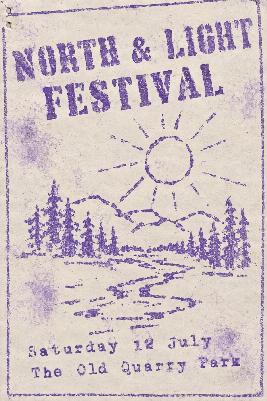
Mimeograph is older, cruder and usually one colour, with blotches rather than clean misregistration.
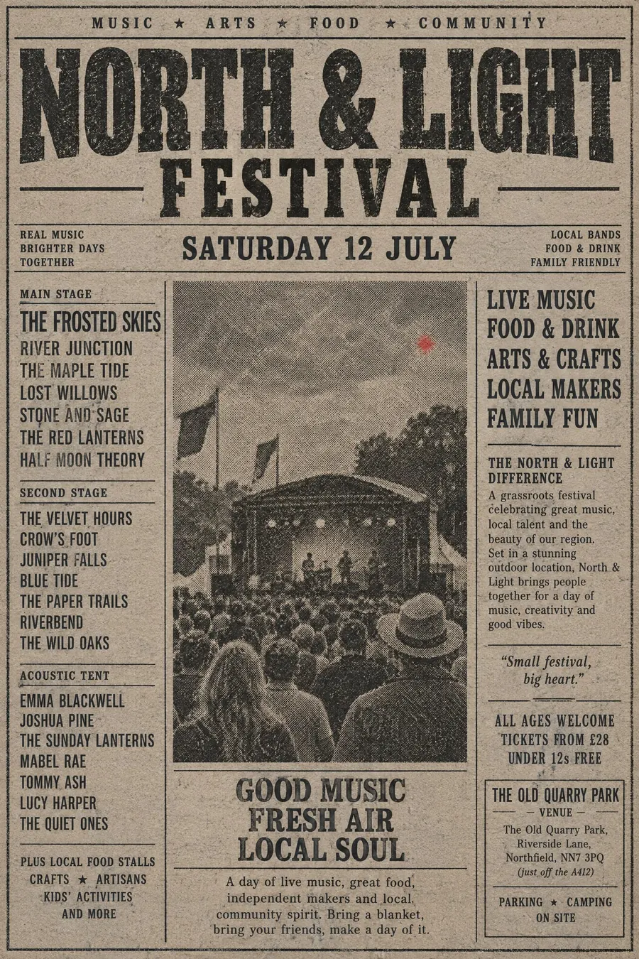
Halftone newsprint is grey and low quality. Riso is bright and deliberately so.
Where it was used
Riso Kagaku built the machines in Japan for churches and schools in the 1980s. Small presses found them cheap and adopted the look wholesale, and studios such as Hato Press in London now print gig posters and books on nothing else.
- Riso Kagaku duplicators
- small press zines
- Hato Press
The prompt
Replace the blanks with your own event, keep the rest. Then run it on an image model.
poster for <event>, risograph print, exactly three spot inks of fluorescent pink bright blue and yellow, each layer slightly misregistered so edges show a coloured fringe, heavy paper grain and mottled ink coverage, overlapping inks making a darker third colour, bold simple shapes with no fine detail, chunky sans lettering knocked out of a solid ink area, <date, time and place> in one ink only
What goes wrong
The model returns a clean flat design with a grain overlay. Ask for each ink layer to be visibly misregistered with coloured fringes at the edges.
The second failure is too many colours. Say exactly three spot inks and name them.
Leave out
photographic gradients, four-colour process, clean registration, fine detail
Watch for
Riso cannot do smooth. Any gradient must be a halftone dot pattern, never a blend.
Questions
Print it
Pay for the one run. No subscription, and the price is on the model page before you sign in.