Monochrome and One Accent
- two colour
- black white and one
- duotone poster
Black, white, and one loud colour used only where it has to be looked at.
Opens an image model with the prompt in it. The price is on the page before you sign in.
What it is for
Two colours force a hierarchy. You cannot emphasise everything, so the accent becomes a decision about what actually matters.
It is also the cheapest style here in every sense: it needs no image, it prints in two inks, and it works at any size.
How it works
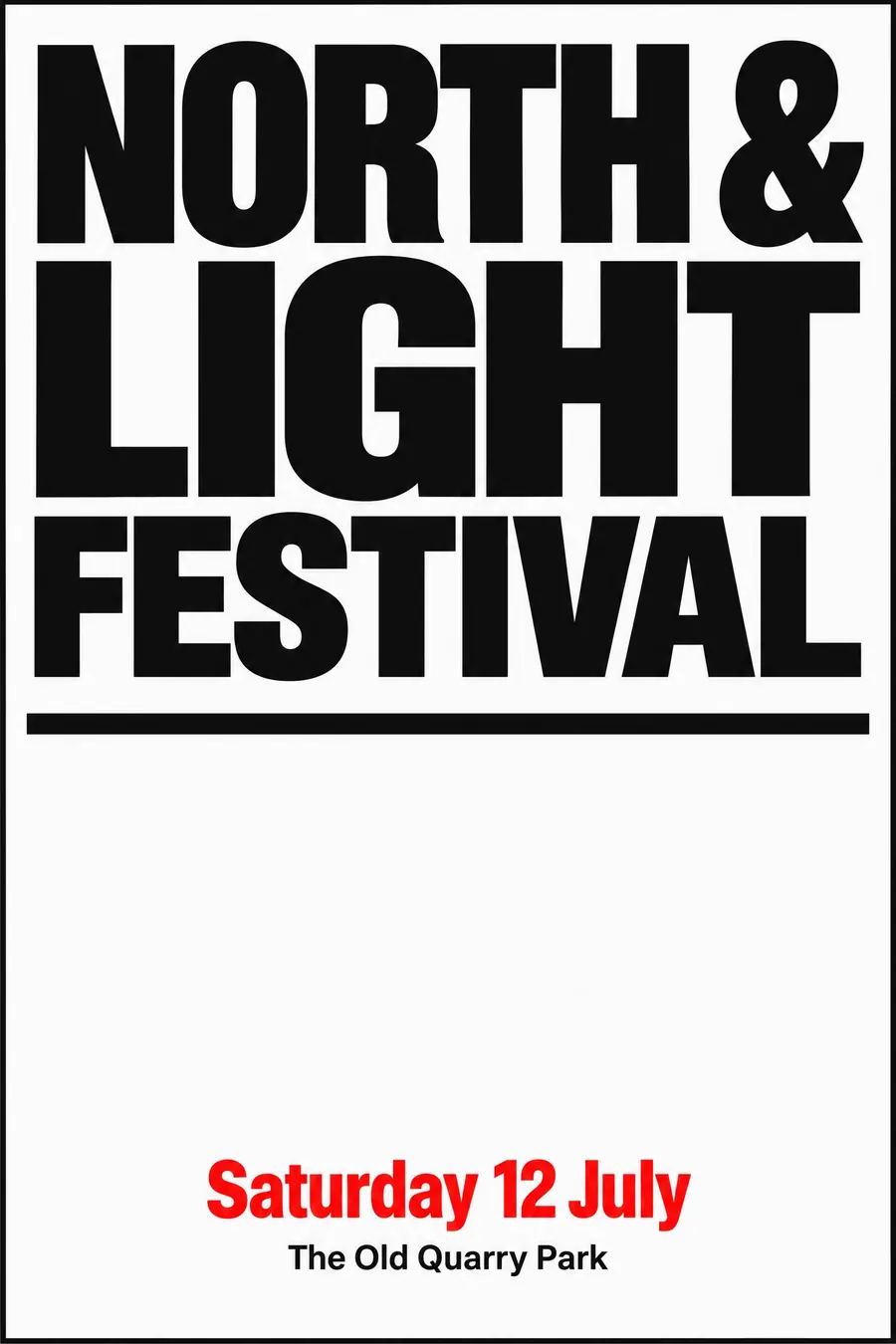
Black and white carry the whole design. No greys, no tints, no soft edges.
Choose one saturated accent and use it on less than a tenth of the sheet, on the single most important element, usually the date or the name.
Set the type very large in the upper half, divide with a thick black rule, and leave the lower half mostly empty.
When to use it
Use it for a talk, a gallery, a club night, a fundraiser, a deadline announcement, anything with no image available.
Leave it alone when the event is warm or family-facing. Two colours read as serious.
Told apart from its neighbours
Swiss Style uses the same restraint but keeps a strict grid and usually a photograph.
Minimalism reduces to one element on an empty field. This keeps the type large and dominant.
Brutalism is the same palette pushed until it is uncomfortable, with uneven margins on purpose.
Where it was used
Swiss concert posters made the two-colour rule an orthodoxy in the 1950s. Penguin's tri-band covers did the same for books from 1935, and most modern gallery printing still works to two inks for the same reason: it is cheap and it looks decided.
- Swiss concert posters
- Penguin book covers
- modern gallery print
The prompt
Replace the blanks with your own event, keep the rest. Then run it on an image model.
poster for <event>, monochrome poster with a single accent, black and white only plus one saturated accent colour used on no more than a tenth of the sheet, the accent placed on the one thing that must be read first, no illustration, very large black type filling the upper half, a thick black rule dividing the sheet, generous white space below, <date, time and place> in small black type with the date alone in the accent colour
What goes wrong
The model adds a second accent. Say exactly one accent colour on less than a tenth of the sheet, everything else black and white.
The second failure is grey tints creeping in. Ask for pure black, pure white and the accent, with no greys.
Leave out
second accent colour, gradients, illustration, decorative elements, grey tints
Watch for
One accent means one. A second colour halves the power of the first.
Questions
Print it
Pay for the one run. No subscription, and the price is on the model page before you sign in.
Next to it in few inks, drawn by hand