Outline Weight
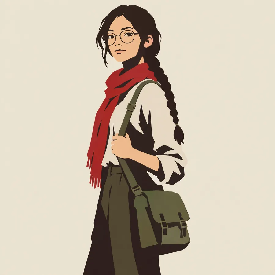
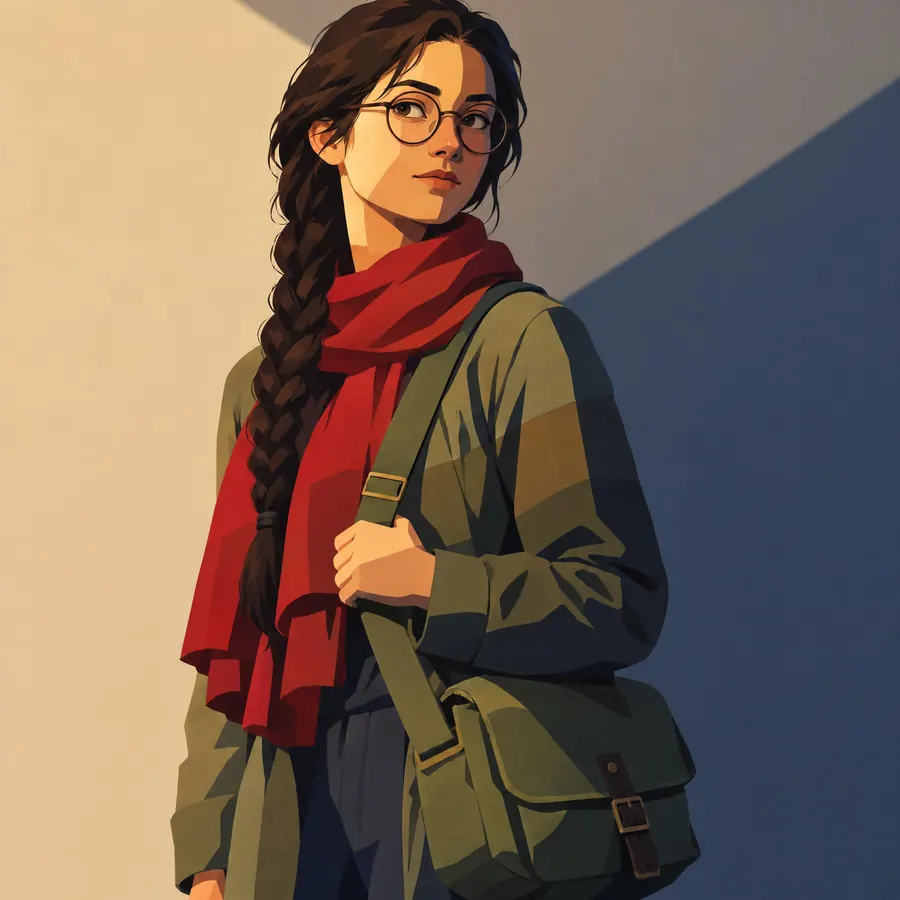
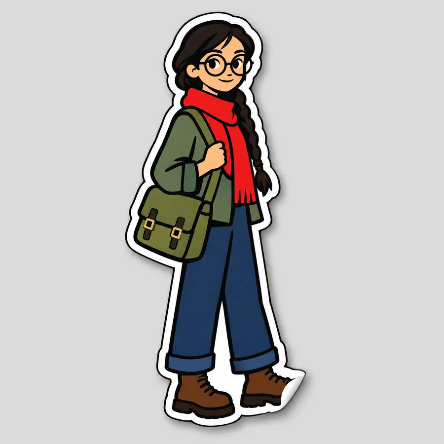
- line weight
- uniform outline
- tapered line
One decision about the line: the same width everywhere, or thick and thin.
Opens an image model with the prompt in it. The price is on the page before you sign in.
What it is for
A heavier line around the outside holds a figure against a background and tells the eye what the silhouette is. A lighter line inside describes detail without competing. Getting that hierarchy right does more for a flat drawing than any amount of rendering.
How it works
The silhouette takes a heavy line of constant width. Interior detail takes a thinner line, also constant. The difference between them is obvious rather than subtle. No line tapers, and no line varies within itself.
When to use it
Use it wherever flat art has to look deliberate, especially in an icon set or a brand system. Avoid it when the drawing wants energy, because a constant line carries none.
Told apart from its neighbours
Ligne Claire uses one weight for everything on purpose, including the background. Toon Outline is the same idea produced by a renderer. Shonen Ink tapers every stroke.
- Ligne Claire
- Toon Outline
- Shonen Ink
Where it is used
It carries an icon set, a brand illustration library, a comic and any drawing that has to stay consistent across many pictures.
- Comics, iconography and animation clean up
- Brand illustration systems
The prompt
Replace the blanks with your own character, keep the rest. Then run it on an image model.
<character>, drawn with a deliberate outline weight, a heavy line of constant width around the whole silhouette and a much thinner line of constant width for every interior detail, no tapering anywhere so each line holds one thickness from end to end, the two weights clearly different rather than gradually varied, flat colour inside, a plain background so the line reads
What goes wrong
A drawing with one weight throughout comes back and looks flat. Ask for two clearly different weights, heavy outside and thin inside.
Leave out
a tapered brush line, varying weight within one line, hatching, a sketchy multi stroke line, an outline that matches the interior
Watch for
Two weights, clearly different. Fine control of line weight is the single most reliable way to make flat art look professional, and the fastest way to make it look amateur is to use one weight for everything.
Questions
Draw it
Pay for the one run. No subscription, and the price is on the model page before you sign in.