8 AI Image Generator Prompts That Work in 2026
November 17, 2026 · 17 min read
People often write an AI image generator prompt that names an object and stops. That is the failure point. When a prompt only says what the thing is, the model invents the light, the lens, the palette, and the background, and every result lands in the same soft, generic middle.
The behavior shows up in the data. The DiffusionDB dataset was assembled from 1.8 million unique user prompts, and in a questionnaire of 64 text-to-image users, 47 used generators almost every day and 15 used them several times per week. Prompt formulation still came in as the second most frequently reported obstacle, named by 20 of the 64 respondents, according to the DiffusionDB prompt study. Frequency does not fix the problem.
The strongest prompts add three things a bare subject line cannot carry: a style, a lighting rule, and a constraint the model has to respect. Structure beats vocabulary. A merchant who writes "[object] on a clean background, soft key light from the left, no text" gets a usable frame more often than someone stacking twenty adjectives.
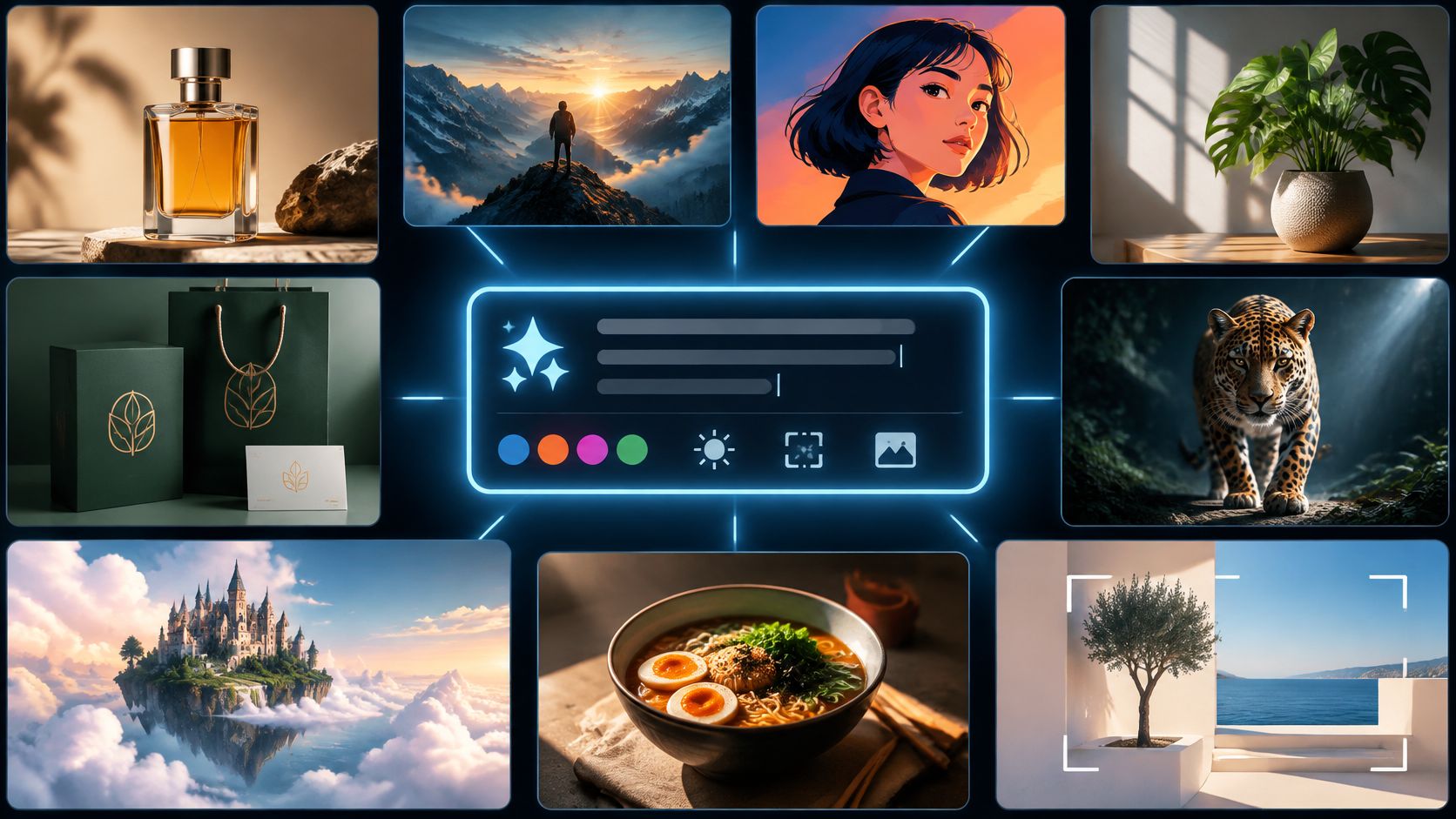
Eight formats cover the jobs many teams run, one per creative job, and each one adapts across product shots, branding, illustration, and cinematic scenes. If you have not settled on a model yet, compare top AI image generators before you build a library of prompts around one.
Table of Contents
- 1. Product Photography on a Clean Background
- The sentence that survives a catalog
- 2. Pet Portrait in a Painted or Photographic Style
- Where detail cuts both ways
- 3. Minimal Logo Concept
- Where prompts cross into risk
- 4. Consistent Icon Set
- Write the rule once, then reuse it
- 5. Cinematic Lighting Photograph
- Score the requirements, not the vibe
- 6. Vintage Print Poster Style
- Test at the size you will print
- 7. Flat Vector Illustration Treatment
- What flat style hides and what it exposes
- 8. Stylized 3D Product Render
- The model matters more than the words
- The 8 prompt styles at a glance
- Run Your First Prompt Today
1. Product Photography on a Clean Background
A catalog frame is a production unit, not a creative experiment. One item, one surface, one light setup, one camera angle, and a background color you can repeat across a hundred SKUs.
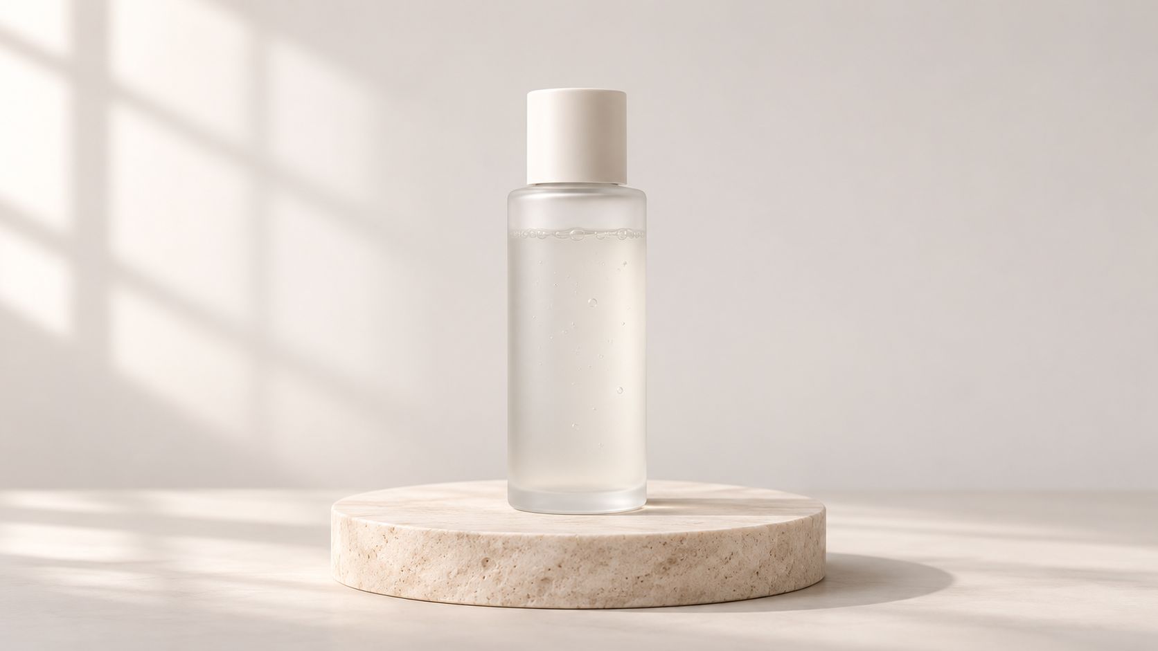
Three prompts that work as written:
- Skincare: "A frosted glass serum bottle on a pale stone slab, soft window light from the left, three-quarter view, clean beige background, no text."
- Leather goods: "A leather wallet photographed from above on a warm oak surface, soft overhead diffusion, gentle contact shadow."
- Homeware: "A ceramic mug at a three-quarter angle on a white smooth backdrop, even softbox lighting, subtle shadow under the base."
The sentence that survives a catalog
Keep the frame and swap the variables. The version that holds across models names the product, isolates it, sets one light direction, and describes surface and finish.
A format I copy for nearly every physical product: "[product type] in [material and finish], isolated on a clean background, even lighting from [direction], [surface], [camera angle]."
- Name the material first. "Brushed aluminum water bottle" forces a decision about surface. "Nice bottle" does not.
- Set one light direction. Soft key from the left, rim from behind, overhead diffusion. Two competing sources flatten into mud.
- Write "no text" every time. Invented labels and fake packaging copy are the most common reason a shot gets rejected.
- Compare four variants at 100 percent. Check the silhouette, the cap line, and logo placement before anything reaches a product page.
Readable packaging pushes you to a different model. A benchmark of image text rendering that covered GPT-4o, Gemini 2.0, Recraft V3, Imagen 3, Seedream 3.0, FLUX 1.1 pro, Qwen-Image and nano-banana among others found GPT-4o and Gemini 2.0 significantly ahead on character accuracy, word accuracy and instruction adherence across languages and text lengths (image text rendering benchmark). When labels have to be legible, start there.
Plan background removal as a separate step rather than prompting around it. What removing a photo background with AI costs covers the trade-offs, and teams shooting for several marketplaces get further with standardizing SKU photography across channels than with a longer prompt.
2. Pet Portrait in a Painted or Photographic Style
A pet portrait has one job. The owner has to recognize the animal instantly and still want the picture on a wall. Breed, coat markings, and expression carry more weight than the medium.
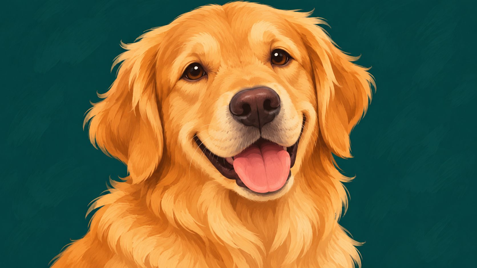
Three directions that read well as gifts:
- Renaissance oil: "A golden retriever in a Renaissance oil portrait, dark umber background, warm side light, visible brush texture, seated and facing the viewer."
- Watercolor: "A tabby cat in a soft watercolor style, pastel washes, visible paper grain, loose edges, plain white background."
- Studio photograph: "A rescue dog in a studio photograph, warm rim light, charcoal backdrop, shallow depth of field, calm expression."
Where detail cuts both ways
More description does not automatically mean a better gift. In a user study with 200 human participants, images produced from more detailed prompts were easier for people to recognize as AI-generated than images produced from shorter, less detailed prompts (prompt detail and AI detection study). On a portrait you sell as finished artwork, that trade-off is real.
So build in layers. Write the animal first, add the medium second, and hold back the extra adjectives.
What I keep out of a pet prompt: "hyperrealistic, 8K, ultra detailed, trending on artstation." Those words add synthetic texture without improving likeness.
- Describe the coat properly. "Red golden retriever with a lighter chest and a white muzzle" gives the model something to match.
- Pick one style and name it. Oil, gouache, watercolor, or studio photograph. Mixed signals produce a plastic hybrid.
- Use a reference image when likeness matters. Image-conditioned models hold ear shape and eye spacing that text alone loses.
- Zoom into eyes and paws before printing. Six fingers on a hand is obvious. Four toes on a paw is not, until a customer sees it.
Pet portraits are a common first job for small studios, and the AI pet portrait workflows show how one brief gets reused across styles.
3. Minimal Logo Concept
A logo prompt generates sketches, not identities. Treat the output as a direction to redraw in vector software, and the tool becomes useful.
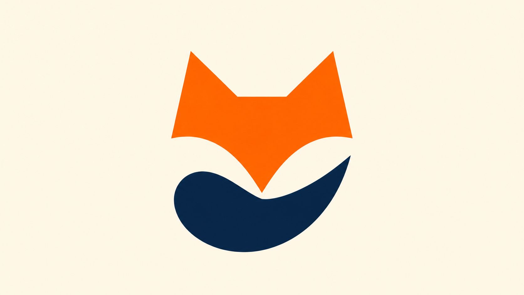
Three concepts worth generating:
- Animal mark: "A minimal fox head built from three triangles, orange and navy, flat vector style, plain white background, centered, generous empty space, no text."
- Monoline: "A coffee brand mark drawn as a single continuous line, bean shape formed by the curve, one color, flat vector, no text."
- Geometric: "A tech startup symbol built from three overlapping circles, flat colors, two-tone palette, plain background, centered, no text."
Where prompts cross into risk
Naming a living artist, a competitor's mark, or a recognizable character is the point where a prompt stops being a style note and becomes exposure. Research on diffusion models reports that they can reproduce content resembling training data, and that certain instruction strategies reduce similarity to that data (prompt structure and training-data similarity). The same body of work argues that ambiguity has a place, since vague prompts are useful for probing how a system fills in social and cultural gaps.
For commercial work, describe transferable properties instead of sources: geometric, single weight, high contrast, warm palette, no gradients.
- Ask for no text. Generated lettering is almost never usable. Add the wordmark yourself.
- Limit the palette to two colors. More colors means more cleanup in vector software.
- Request flat vector style on a plain background. Both make tracing and autotracing cleaner.
- Run a trademark search before you fall in love with a concept. A shape that resembles an existing mark costs more to abandon later than to check now.
4. Consistent Icon Set
A toolbar of ten icons drawn at ten slightly different stroke weights looks broken, even when every icon is well drawn on its own. The prompt's real job is holding the rules constant while the subject changes.
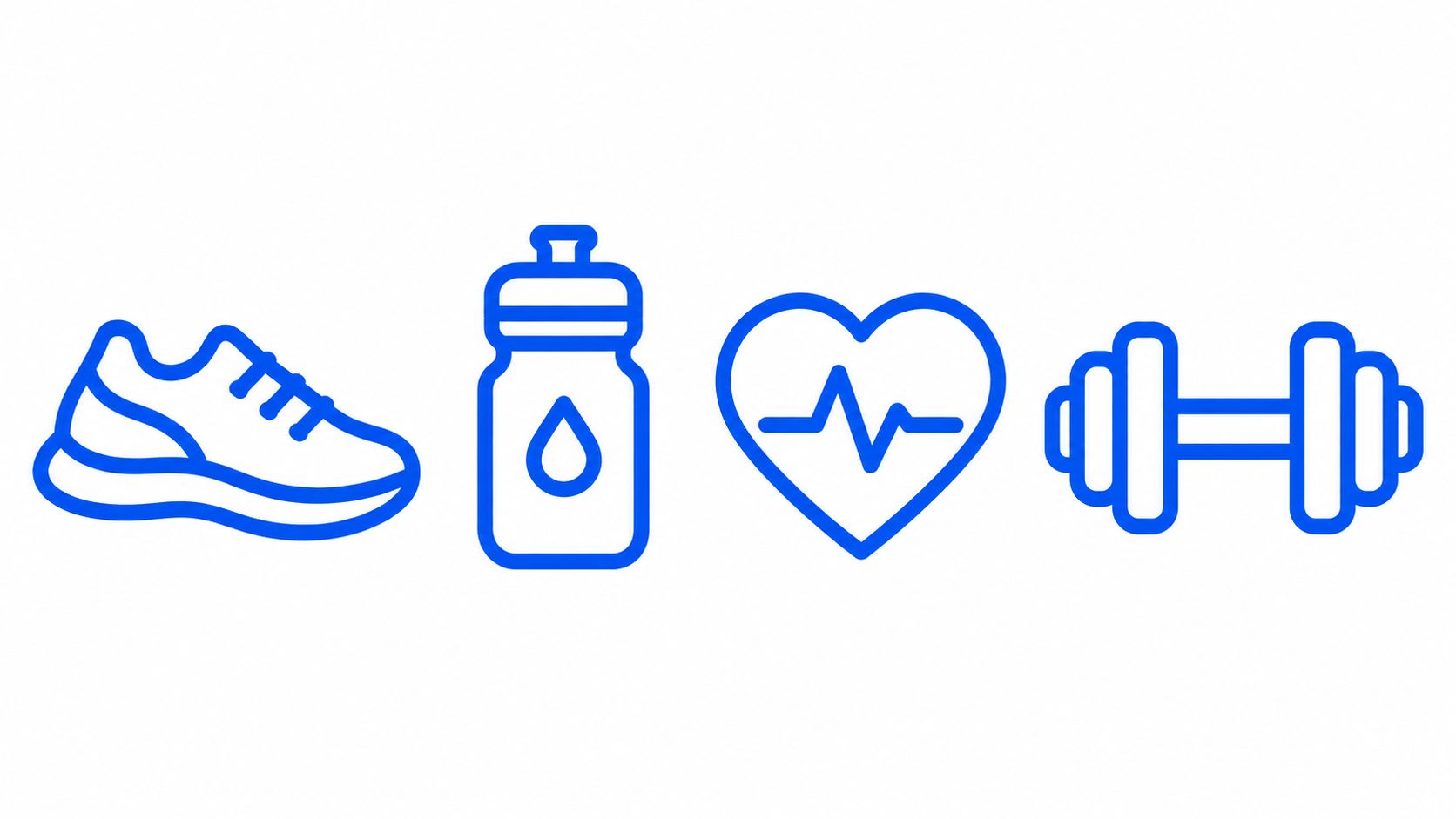
Three set briefs:
- Fitness app: "A set of ten outline icons for a fitness app, 2px stroke, rounded caps, single blue color, 24px grid, no fills, plain white background."
- Travel booking: "A set of eight filled icons for a travel booking site, rounded corners, single navy color, consistent padding, flat vector."
- Appliance catalog: "A set of six line icons for kitchen appliances, 1.5px stroke, square caps, single charcoal color, matched optical weight."
Write the rule once, then reuse it
All three briefs share one skeleton: a set size, a stroke or fill spec, a single color, a grid or padding rule, and a short list of bans. Swap the subject list and the style terms, and the same template covers almost any icon family.
Style rule for a whole family: 2px stroke, rounded caps, 24px grid, 2px inner padding, one color, no gradients, no shadows, no perspective.
Short prompts are enough for this job. The PromptMap study built a synthetic dataset of 12.3 million image prompts, and its generated prompts averaged 17.2 words with a standard deviation of 3.7, against 38.0 words with a standard deviation of 22.3 in DiffusionDB. The tight spread on the generated set shows how little a template prompt needs to say. Undefined rules are what break a set.
- Generate the whole set in one batch. Separate runs drift in stroke weight and corner radius.
- Name each subject plainly. "Running shoe, water bottle, heart rate, dumbbell" beats a paragraph of description.
- Compare icons side by side at display size. A circle and a star at the same stroke read differently on screen, so judge optical weight rather than the pixel spec alone.
- Convert to vectors before shipping. Tracing cleans the edges and makes scaling free.
5. Cinematic Lighting Photograph
Cinematic is not a mood word. It is a set of decisions about light direction, lens length, and distance to subject, and the prompt has to name them out loud.
Three scene prompts:
- Noir street: "A detective walking through rain at night, neon sign backlight, 40mm lens, shallow depth of field, wet asphalt reflections, wide 16:9 frame."
- Product with drama: "A glass bottle on a dark table, single warm rim light from behind, deep shadow, 85mm lens, black background."
- Desert vista: "A desert ridge at golden hour, long shadows, warm low sun, 24mm lens, wide 16:9 frame, clear sky."
Score the requirements, not the vibe
Cinematic prompts stack requirements: subject, action, light, lens, environment, framing. Complex prompts are where models drop parts. The GenAI-Bench study collected 1,600 real-world prompts from graphic designers and had three annotators rate each image and prompt pair on a 1 to 5 Likert scale. It found that VQAScore, which checks whether a vision-language model can answer questions about the generated image in relation to the prompt, agrees significantly more strongly with human judgments than CLIPScore on complex prompts.
In practice, that means you separate the checklist. Look at subject identity, count, attributes, spatial arrangement, interaction, framing, and style one at a time. A frame that feels good can still miss the light direction you asked for.
One light, one lens, one mood. Two lighting terms in a single prompt usually cancel each other out.
- Pair a lighting term with a lens term. Backlight plus 40mm, rim light plus 85mm. "Cinematic" on its own does nothing.
- Keep the scene sentence short. Extra clauses dilute the lighting instruction.
- Generate wide. A 16:9 frame suits storyboards and campaign boards better than a square.
- Cap the cast. Two people in one scene already strain spatial accuracy.
6. Vintage Print Poster Style
Print styles work when you name the process. "Vintage" is a vibe. Risograph, letterpress, and screen print are instructions.
Three print briefs:
- Riso gig poster: "A concert poster in a two-ink risograph style, fluorescent pink and teal, visible grain, slight misregistration, bold shapes, clear paper area at the bottom, no text."
- Letterpress travel print: "A mountain travel print in a letterpress look, warm cream paper tone, deep impression texture, two inks, simple geometric peaks, no text."
- Halftone wall print: "A coffee shop wall print with bold shapes and halftone dots, two colors, coarse dot screen, flat paper texture, no text."
Test at the size you will print
Resolution changes adherence. A prompt-adherence evaluation of 9,216 generated images using simple combinations of shape and location found that the highest first-iteration F1 score at 512 by 512 was 76%, from Stable Diffusion 3.5 Large Turbo, and that adherence dropped when output changed from 1,024 by 1,024 down to 512 by 512 (prompt adherence evaluation). Simple requirements already fail at the wrong size. A poster brief with texture, ink count, and layout will too.
- Name the method and the ink count. Two inks, three inks, one ink on kraft.
- Ask for grain or halftone explicitly. Texture is the part models skip by default.
- Write "no text" and reserve a clear area. Typography set in software always beats generated lettering.
- Proof the export at final print size. Check dot pitch and edge sharpness before the file goes to a printer.
A two-ink brief beats a fifteen-adjective brief. The ink count is the constraint that makes a riso prompt read as riso.
7. Flat Vector Illustration Treatment
The hard part of illustration is not vocabulary. It is deciding what matters before you generate anything.
Research on non-expert prompting found that inexperienced users could write rich descriptive prompts yet lacked the style-specific vocabulary AI art communities use, and that non-experts overestimated how closely their output matched a target image when working without systematic guidance (study of non-expert prompt writing). The fix is a brief with fixed slots, not a bigger word list.
Five slots to fill before you generate:
- Composition and proportion: "one focal subject, seated group, generous white space above the heads."
- Subject: "three people around a laptop in a meeting, simplified faces without features."
- Color and tone: "palette of #F2E8DC, #2F4858, #86BBD8 and #F6AE2D, flat fills, no gradients."
- Thematic intent: "calm, collaborative, product led, no celebration imagery."
- Critical details: "rounded shapes, no outlines, no shadows, no textures."
What flat style hides and what it exposes
Flat vector forgives anatomy and punishes inconsistency. A misplaced limb disappears into the shape language. A stray shadow or gradient stands out immediately. That makes it a good first style for a team new to generation, because errors are visible and fixable.
- State outlines or no outlines. Mixing them inside one illustration reads as a mistake.
- Keep one focal point. Busy scenes lose the flat, readable quality that made you choose the style.
- Pull colors from a named palette reference. Consistent tones across a campaign matter more than any single frame.
- Convert to vector before scaling. What AI vector models and SVG output actually cost explains when tracing beats native vector generation.
8. Stylized 3D Product Render
Here is the motion reference I send with a 3D brief, so everyone agrees on material and light before a prompt gets written.
A 3D render prompt is a materials list with a camera attached. Name the object, the finish, the light, and the angle. Skip the atmosphere.
Three render briefs:
- Cosmetics mockup: "A matte white cosmetic bottle render, soft studio lighting, light gray smooth backdrop, 50mm angle, subtle contact shadow, no labels."
- Game character: "A stylized toy character with glossy painted surfaces, rounded forms, soft key light from above, neutral gray background, three-quarter view."
- Launch preview: "A pocket-sized gadget with a brushed aluminum body and a black glass front, studio lighting, neutral backdrop, 45 degree angle, crisp reflections."
The model matters more than the words
In a benchmark of automotive instructional imagery that rated 18,551 images by hand, Nano Banana Pro produced 16.9% usable images, Nano Banana 2 produced 14.3%, and GPT-Image-1.5 produced 0.5% (automotive instructional imagery benchmark). The workflow was two-stage: a language model converted technical descriptions and reference-image constraints into structured positive and negative prompts before an image model ran. The downstream model had the largest effect on quality. Prompt preparation and model selection are separate decisions, and a clean brief cannot rescue a weak model.
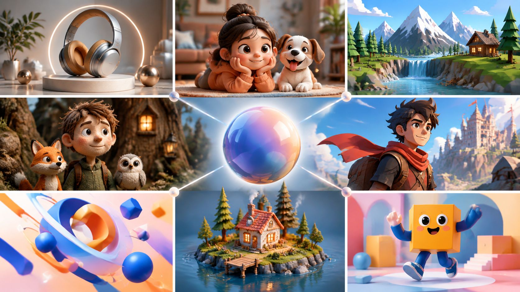
That gap is why the same brief can carry a job or sink it. Treat the prompts above as per-job formats: swap the object and finish, keep the lighting and angle structure.
- Name material and finish in the first clause. Matte plastic, brushed metal, frosted glass. The rest is secondary.
- Lock the angle in numbers. "45 degree" and "three-quarter view" hold up across regenerations better than "dynamic angle."
- Use a neutral backdrop. Gray or white lets you composite the object later.
- Pick a model that matches the output format. A text-to-3D model gives you geometry. An image model gives you a picture of geometry.
The 8 prompt styles at a glance
| Prompt style | Best for | Key rule to specify | Main risk |
|---|---|---|---|
| Product Photography on a Clean Background | Consistent e-commerce catalog images | Specify product details, lighting, camera angle, and clean background | Product details or fine textures may be inaccurate |
| Pet Portrait in a Painted or Photographic Style | Custom pet artwork, gifts, and prints | Describe breed, coat markings, expression, and one clear art style | Exact likeness and accurate anatomy can be difficult |
| Minimal Logo Concept | Exploring early brand identity ideas | Specify simple shapes, limited colors, flat style, and no text | Misspelled text or resemblance to existing trademarks |
| Consistent Icon Set | App interfaces, websites, and presentation graphics | Define shared stroke, corner style, canvas size, and spacing | Style can drift across icons |
| Cinematic Lighting Photograph | Storyboards, mood images, and campaign visuals | Pair the subject with clear lighting, lens, color grade, and composition cues | Heavy styling may obscure details or distort subjects |
| Vintage Print Poster Style | Posters, merchandise, and wall art | Name the print method, ink-color limit, and texture | Text may be unreliable and colors may need print adjustments |
| Flat Vector Illustration Treatment | Websites, presentations, and social content | Specify palette, outline treatment, and a simple focal composition | Results can look generic or make figures appear stiff |
| Stylized 3D Product Render | Product mockups, packaging previews, and game assets | Specify material, finish, studio lighting, and camera angle | Geometry may be inaccurate or need cleanup |
Run Your First Prompt Today
Prompting has changed shape since DALL·E was announced on 5 January 2021, DALL·E 2 on 6 April 2022, and DALL·E 3 on 20 September 2023. What started as a one-line description became a structured brief covering subject, environment, style, rendering, composition, and constraints. Length alone is not the point. In one automatic prompt-engineering study that assembled 143,000 prompt pairs, reported high-quality prompts averaged 197.8 units of text against 40.3 for low-quality prompts, roughly 4.9 times longer (automatic prompt engineering study). Richer specification encodes more requirements. It doesn't guarantee a better frame.
So start small. Pick the one format above that matches the job on your desk today. Replace the subject, keep the style rule and the lighting rule, and generate four variants instead of one. Then compare them against the brief requirement by requirement rather than by overall feel.
Three habits make the loop faster:
- Keep a saved brief per job. A product shot brief, a portrait brief, an icon brief. Reuse beats rewriting.
- Change one variable per run. Two changes at once tell you nothing about which one worked.
- Check at final size and final use. A frame that reads well as a thumbnail can fall apart as a poster.
These eight formats are not magic strings. They are briefs with slots, and the slots are what make them portable across models and repeatable across a catalog. A prompt you can edit in one place and rerun on a different model is worth more than a prompt that only worked once.
Visual Sandbox fits into that loop in a few ways. It offers 21 image models with image generation starting at $0.01 per image, an agent that turns a plain-language request into a model-ready prompt, and access through a web app, CLI, MCP server, and API, so the prompts you settle on travel with you between tools.
Visual Sandbox is a pay-per-use workspace for generating and editing images, video, audio, vectors, and 3D assets with third-party AI models, and every model draws on one shared credit balance. That makes it a practical place to test the eight prompt formats above across different models before you commit a catalog or a brand system to one of them. Visit Visual Sandbox to run your first prompt today.