3D Animation Styles: 9 Looks and When to Use Them
November 16, 2026 · 15 min read
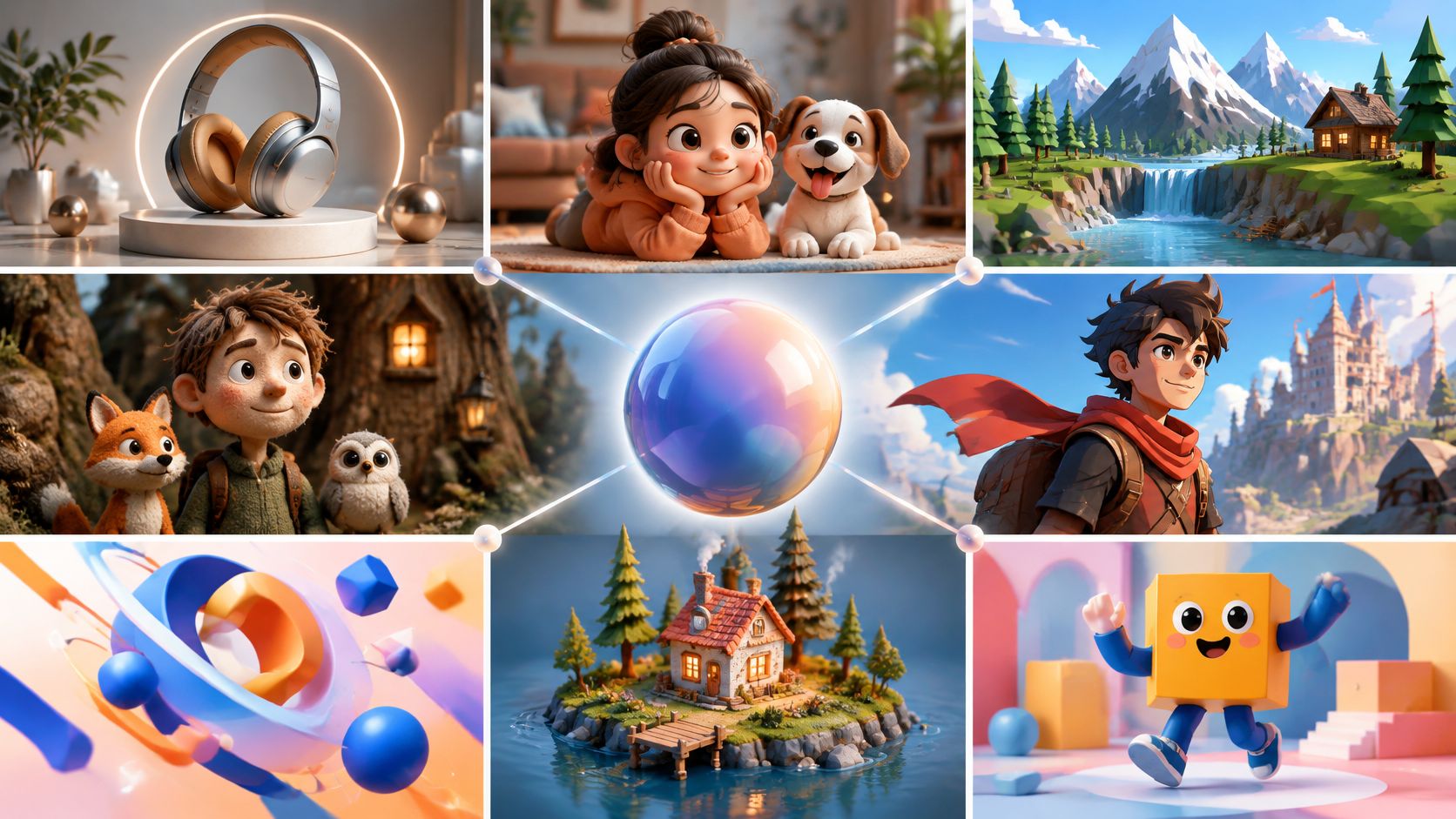
Your small studio needs a product explainer, but the reference folder mixes glossy appliances, cartoon mascots, and blocky game worlds. A game team wants a signature look that won't overwhelm its production budget. A brand wants warmth without making its products look like toys. Each brief points toward a different style.
Choosing between 3D animation styles means choosing how you'll model, light, animate, and revise the work. A simple-looking character can need a demanding facial rig. A realistic product can be straightforward to animate but difficult to shade. A handmade finish can take more deliberate work than a clean digital surface.
The useful question isn't which look is best. It's which look makes your message clear at the level of effort your project can support. For campaign planning beyond the visual treatment, these video marketing strategy guides offer related context.
Keep the immediate brief in view:
- Product explainer: Show the mechanism or benefit without decorative clutter.
- Game identity: Make characters and environments recognizable during play.
- Brand storytelling: Match materials, movement, and expression to the feeling you want.
These nine looks cover distinct visual approaches, suitable project types, and production choices worth testing before you commit to detailed assets.
Table of Contents
- 1. Stylized Feature Film CGI
- Best for character-led stories
- 2. Photorealistic CGI
- Build realism around the shot
- 3. Cel-Shaded Toon 3D
- Best for graphic action and explainers
- 4. Anime-Style 3D
- Design for the camera
- 5. Low-Poly 3D
- Keep the simplification intentional
- 6. Voxel 3D
- Keep the grid consistent
- 7. Claymation-Style 3D
- Best for warmth and handmade character
- 8. Isometric 3D
- Build a system, not isolated scenes
- 9. Soft Pastel Motion Design 3D
- Make softness deliberate
- How the 9 3D Animation Styles Compare
- Match the Style to the Project Before You Model
- Test the expensive decisions early
1. Stylized Feature Film CGI
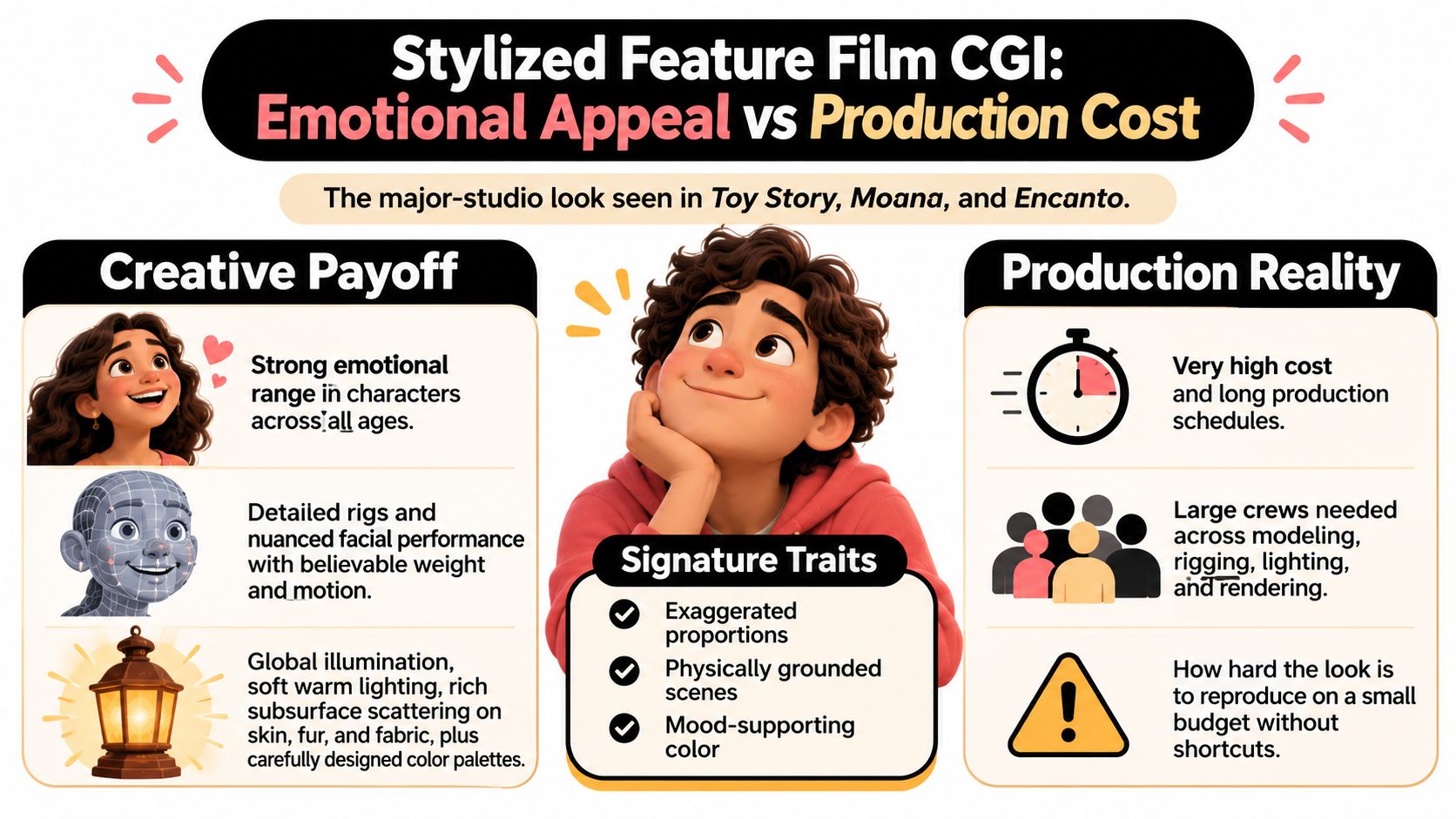
Stylized feature film CGI combines exaggerated design with believable weight and lighting. Characters can have oversized eyes, compressed bodies, or impossible hair, yet still feel grounded when they sit, jump, or pick something up.
Pixar's Toy Story became the first entirely computer-animated feature in 1995, according to The Spokesman-Review's production retrospective. It established that digital characters could carry a full emotional story, not just a technical demonstration. Walt Disney Animation Studios' Moana (2016) and Encanto (2021) are useful references for expressive proportions, rich environments, and carefully directed color.
Best for character-led stories
Choose this look for a recurring mascot, family-oriented entertainment, or an explainer where viewers need to care about a character. Say a delivery service wants to explain a stressful return process. A stylized courier can communicate confusion and relief more clearly than an anonymous realistic figure.
The trade-off is rigging and performance work. Simplified anatomy doesn't eliminate deformation problems. Broad smiles, squash, and extreme poses need models built to support them.
- Test silhouettes first: Approve proportions in flat, untextured views before sculpting details.
- Separate with light: Try a warm key and cooler fill, then check that skin and costume colors still read correctly.
- Build visual references: Compare character concepts, cinematic lighting, and palette boards before modeling.
- Test difficult poses: Check a deep crouch, broad smile, and overhead reach before approving the rig.
The comparison below highlights the central compromise: emotional range comes with substantial production demands.
2. Photorealistic CGI
A brushed-metal kettle doesn't need expressive eyes. It requires convincing reflections, accurate proportions, and a lid that moves like the actual mechanism. Photorealistic CGI works when viewers must judge a physical object or believe a digital element belongs in filmed footage.
References include Industrial Light & Magic's LED-volume virtual production for The Mandalorian (2019 onward), Weta Digital's Pandora environments and creatures in Avatar (2009), and consumer-electronics or automotive launch visuals.
Realism depends on more than dense geometry. The ACM paper on RenderMan's architecture describes light transport for reflections, shadows, surface scattering, subsurface scattering, and volumes. Those interactions explain why believable materials require a coordinated lighting and rendering setup.
Production rule: Fix scale, camera, and material response before adding surface wear. Dirt won't rescue incorrect reflections.
Build realism around the shot
Match focal length, camera height, and depth of field to the live-action plate when compositing. Use calibrated lighting references or measured real-world values where available, rather than guessing intensities independently.
For e-commerce, prototype product imagery and lighting variations before building a complete animated scene. An online 3D model generator workflow can provide a starting asset, but inspect dimensions, topology, labels, and material assignments before treating it as production-ready.
The main compromise is revision and rendering burden. Glass, hair, translucent plastics, and reflective surfaces expose errors quickly. Inspect final-resolution frames for texture seams, edge artifacts, noise, and label distortion, especially around close-up product details.
3. Cel-Shaded Toon 3D
Cel shading trades continuous gradients for graphic decisions. Flat color bands, controlled shadows, and ink-like outlines make volumetric models read more like illustrated artwork.
Spider-Man: Into the Spider-Verse (2018), from Sony Pictures Animation with Sony Pictures Imageworks, demonstrates a broader comic-inspired approach that includes print textures and graphic effects. Gearbox Software's Borderlands series uses illustrated surfaces and bold contours. Arc System Works' Dragon Ball FighterZ shows how carefully controlled 3D characters can resemble drawn animation.
These references aren't interchangeable shader presets. Their appeal also comes from posing, texture design, compositing, and timing.
- Simplify shadow bands: Start with a light region and a shadow region. Add another band only if it improves readability.
- Control outlines: Keep thickness stable, or vary it deliberately with depth. Watch small facial features.
- Test backgrounds: Check the same character against pale, dark, and saturated environments.
- Set graphic rules: Establish palette, line weight, halftones, and speed-line treatments in reference frames before modeling.
Best for graphic action and explainers
Use this style for comic-led campaigns, action games, or educational characters that need strong silhouettes. A cybersecurity explainer, for example, can use outlined characters and flat threat icons without pretending that abstract concepts are physical products.
The hidden cost is shot-specific cleanup. A shadow boundary can slide across a face in an ugly way even when the underlying lighting is physically reasonable. Artists often adjust normals, shadow masks, or individual poses to protect the drawing.
Watch how graphic choices influence the reading of movement in this animation reference.
4. Anime-Style 3D
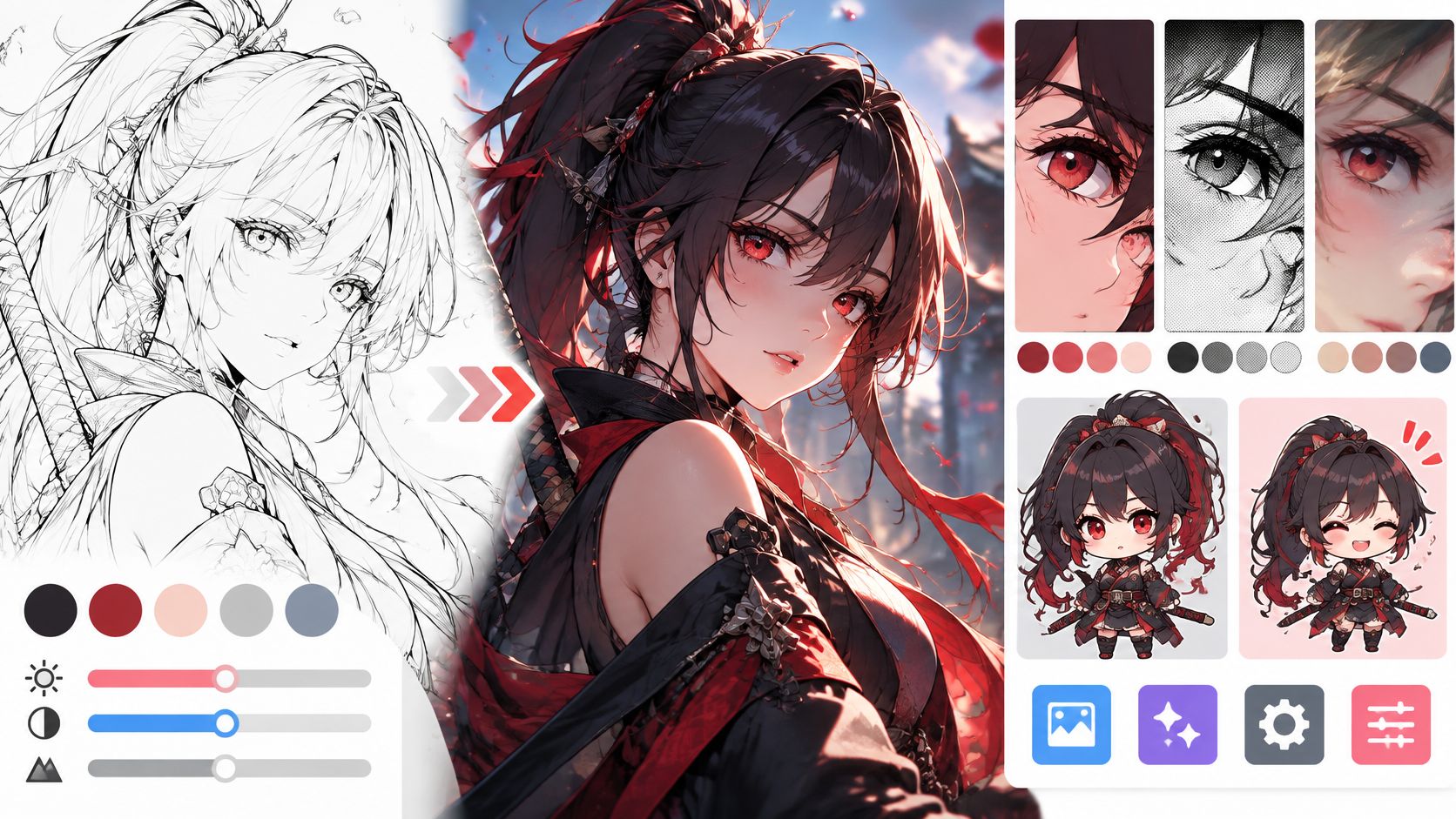
Anime-style 3D depends as much on character construction and performance as on toon shading. Clean color areas, expressive eyes, sculpted hair masses, and carefully placed facial shadows create the identity.
miHoYo, also known as HoYoverse, uses this visual territory in Genshin Impact. HoYoverse's Honkai: Star Rail offers another reference, while Arc System Works' Guilty Gear Strive demonstrates particularly deliberate posing and camera-dependent character presentation.
This portrait illustrates the kind of clean shapes and controlled color separation worth establishing during concept development.

Design for the camera
Choose anime-style 3D for character-driven games, virtual presenters, or branded entertainment with an established illustrated identity. Don't select it solely because a target audience is young. Costume conventions, expressions, and genre references need to fit the actual audience.
Prototype front, profile, and angled views before committing to topology. An anime image-generation workflow can help explore those views, but an artist must reconcile inconsistent accessories and facial proportions.
- Define shape language: Use rounded or angular forms intentionally, rather than assigning every character the same face.
- Separate hair and clothing: Add restrained rim lighting where silhouettes merge with the environment.
- Keep controls usable: Build a focused facial rig around the expressions the script needs.
- Balance material detail: Use anime-style PBR texturing techniques selectively so surface response doesn't overpower graphic shading.
The trade-off is view dependence. A beautiful frontal face may fail in profile, and automatic lighting can create unwanted nose or cheek shadows. Approve a moving turnaround, not just a hero portrait.
5. Low-Poly 3D
Low-poly work makes facets, silhouettes, and color blocks carry the design. It's a strong option when detailed surfaces would distract from the action or make an asset library harder to maintain.
Superhot, developed by Superhot Team, is a useful reference for minimal, faceted visual language. The same approach suits app-onboarding explainers and indie puzzle or exploration environments. Say an onboarding video needs to show a parcel moving through a delivery network. Simple vehicles and buildings can explain the route without modeling every hinge and window.
The performance advantage isn't automatic. A low-polygon scene can still run poorly if it contains excessive objects, expensive transparency, or complicated shaders. Judge the complete scene, not only the mesh count.
Keep the simplification intentional
- Restrict the palette: Choose a compact set of colors with distinct roles for objects, backgrounds, and emphasis.
- Reveal the facets: Use directional lighting, then soften it enough to avoid distracting contrast.
- Refine generated bases: Reduce geometry while protecting silhouettes, joints, and recognizable product features.
- Match the movement: Use clear holds and snappy transitions rather than unnecessary secondary motion.
The comparison of low-poly and high-poly workflows is useful when deciding where geometric detail earns its cost.
Avoid indiscriminate decimation. It can damage deformation and create random triangles that look accidental. Low-poly art works best when an artist decides which planes matter, especially around faces, hands, and branded product contours.
6. Voxel 3D
Voxel art uses a block-based visual vocabulary, usually organized around a consistent grid. Unlike low-poly art, which can use freely shaped facets, voxel-style objects read as assemblies of small cubic units.
Mojang Studios' Minecraft is the familiar reference for block-built worlds. Hipster Whale's Crossy Road uses blocky characters and environments with a related visual appeal. MagicaVoxel is a practical tool for building voxel characters, props, and merchandise concepts.
Choose this approach for modular game worlds, collectible characters, or playful demonstrations where objects should look assembled. A maker-focused brand could show a workspace building itself from blocks, then reuse the same parts in still illustrations.
A blocky model isn't automatically cheap to render. Hidden faces, dense grids, and elaborate lighting can erase the savings.
Keep the grid consistent
Set the voxel scale before creating an asset family. If a character's hands use visibly smaller blocks than the furniture, the mismatch needs to look intentional.
Generate concept references before construction, then inspect a small preview to check silhouettes. Use ambient occlusion sparingly to separate touching cubes without turning every crevice black. For animation, decide whether limbs rotate as rigid pieces or whether forms rebuild between poses.
Voxel scenes and faceted low-poly scenes can share a compact, toy-like composition, though their geometry follows different rules. This island reference is useful for composition and color, rather than as a strict voxel construction guide.
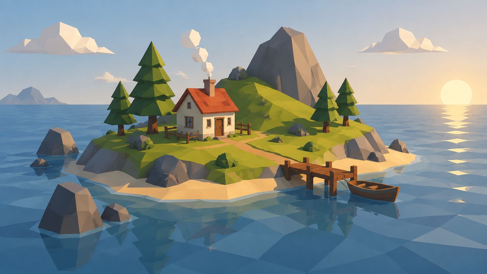
The main limitation is detail resolution. Tiny logos, subtle expressions, and narrow components may not survive the grid.
7. Claymation-Style 3D
A clay-look character can make a small gesture feel personal. Soft contours, uneven surfaces, fingerprints, and restrained lighting suggest that someone shaped the object by hand.
Digital claymation is an imitation of a physical process, not the same production method. Aardman Animations' Wallace and Gromit uses physical stop motion. Laika's Coraline (2009) uses stop-motion puppets with 3D-printed replacement faces. Both offer references for tangible materials and crafted performance, but neither should be described as ordinary digital clay CGI.
The relationship between digital imagery and handmade aesthetics is part of the broader history discussed by Smithsonian Magazine's animation retrospective.
Best for warmth and handmade character
Choose a digital clay finish for food storytelling, approachable explainers, or brands built around craft. A gardening shop could animate a clay seedling struggling toward a light source, using body language rather than a detailed human face.
- Disturb perfect shapes: Add controlled asymmetry to cheeks, edges, and contact areas.
- Use broad lights: Soft area lights reveal volume without making the surface look like polished plastic.
- Study real textures: Build references for clay dents, smears, and fingerprints before making materials.
- Test stepped timing: Try holding each new pose across paired frames, then judge the movement at delivery speed.
The challenge is restraint. Uniform noise looks procedural, while excessive wobble makes objects seem unstable. Place imperfections where hands would plausibly touch the material, and keep the character's main silhouette readable.
8. Isometric 3D
Need to explain how a warehouse, app ecosystem, or factory fits together? Isometric 3D prioritizes spatial clarity over cinematic perspective.
Strict isometric projection uses an orthographic camera with equally foreshortened axes. Artists often describe the familiar diagonal grid as a thirty-degree layout. Related illustration styles may use different camera tilts, so lock the projection before building a shared asset kit.
ustwo's Monument Valley is a useful reference for impossible isometric architecture. Software-onboarding illustrations and management-game layouts show the more practical side: viewers can inspect relationships without objects shrinking dramatically into the distance.
Build a system, not isolated scenes
Start with a modular floor grid, consistent object proportions, and shared camera settings. A software explainer might use the same workstation, server, and delivery vehicle across onboarding screens and an animated overview.
- Lock the view: Save the camera with the kit so contributors don't introduce incompatible projections.
- Match reference sets: Keep icon concepts consistent with the geometry and lighting of the final assets.
- Animate locally: Move doors, conveyors, indicators, or characters while preserving the readable overview.
- Plan tall elements: Check whether buildings and labels obscure important objects behind them.
Material style is independent of projection. Soft, clay-like materials can make an otherwise technical layout feel approachable, as this character reference illustrates.
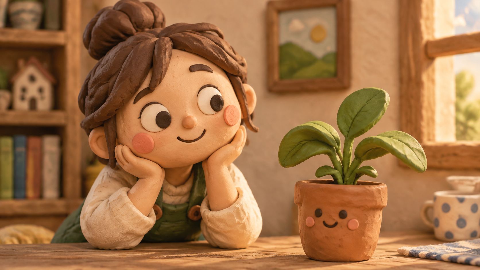
The compromise is reduced cinematic freedom. A large orbit can undermine the composition. Use gentle object motion or controlled reframing instead of treating the scene like a freely moving film set.
9. Soft Pastel Motion Design 3D
Rounded forms, matte surfaces, pastel colors, and broad studio lighting give this style its friendly finish. The emphasis is graphic rhythm, not complex character acting or strict realism.
Typical projects include abstract loops for technology launches, soft product reveals for consumer-goods campaigns, and Cinema 4D motion-design work composited with typography. A skincare launch might combine an accurately shaped container with rounded abstract forms that suggest softness without making unsupported product claims.
This look works well when a campaign needs a coherent family of stills, short clips, and backgrounds. It works less well when every object becomes the same pale blob and the product loses distinction.
Keep the product legible: A soft environment can support a precise product model. You don't need to simplify the item customers are buying.
Make softness deliberate
Choose a compact pastel palette, but reserve enough contrast for labels, text, and the focal object. Use broad area lights and subtle contact shading. Too much ambient occlusion produces dirty creases that fight the clean finish.
Build palette references and mood boards before setting up the scene. Then test an AI motion-graphics workflow for concept exploration while keeping final product geometry and brand details under review.
For loops, match position, velocity, lighting, and any simulated elements across the join. Matching the opening and closing images alone won't prevent a visible hitch. Render a draft in the intended crop so typography and moving shapes don't collide on mobile screens.
How the 9 3D Animation Styles Compare
| Item | Typical Use | Main Strength | Main Limitation |
|---|---|---|---|
| Stylized Feature Film CGI | Animated feature films | Expressive characters and broad audience appeal | High cost and long production schedules |
| Photorealistic CGI | Film visual effects, virtual production, and product visualization | Blends convincingly with live-action footage | Expensive, with small errors easily noticed |
| Cel-Shaded Toon 3D | Stylized games and animated films | Bold graphic look with readable silhouettes | Difficult to keep outlines and shading consistent |
| Anime-Style 3D | Games and streaming animation | Distinctive style with flexible camera work | Can feel generic or clash with 3D environments |
| Low-Poly 3D | Indie games, mobile content, and explainers | Fast to create and efficient to render | Limited realism and detail |
| Voxel 3D | Games, hobby projects, and character art | Easy to learn, create, and edit | Limited fine detail and smooth curves |
| Claymation-Style 3D | Family storytelling and handmade-feel campaigns | Warm, distinctive appearance | Slow to refine and less suited to fast action |
| Isometric 3D | Games, maps, interfaces, and explainers | Clear, easy-to-read spatial layouts | Limited depth cues and organic forms |
| Soft Pastel Motion Design 3D | Brand films, social ads, and motion graphics | Friendly look that adapts well to short-form video | Can look generic and offers limited technical detail |
Match the Style to the Project Before You Model
Start with audience, budget, and delivery format, then shortlist a small set of styles that fit. A product page needs material accuracy and recognizable details. An onboarding sequence needs clear actions. A character-led game needs a visual identity that survives movement, changing environments, and repeated asset production.
Don't assume realism will feel more premium to every viewer. An audience study published on J-STAGE found that 64.3% of younger respondents preferred cartoonish styles, within its study of responses to AI-generated animation. Treat that as a reason to test your audience, not as a universal rule for everyone in that age group.
Test the expensive decisions early
Build comparable references around the same subject and action. Changing the camera, product, and composition between treatments makes it harder to judge the style itself. Follow the still-image comparison with a short motion test, because attractive shading can break when a face turns or a reflective product rotates.
- Check revisions: How difficult is a color change, new expression, or replacement product?
- Check delivery: Does the composition survive vertical cropping and small-screen playback?
- Check reuse: Can the asset become a still, animated clip, interactive object, or simplified illustration?
- Check rendering: Which materials, effects, and lighting choices create the heaviest work?
The International Journal of Creative Multimedia analysis describes the trade-off between higher initial investment in 3D assets and their potential for long-term reuse. That's the useful economic lens: assess the deliverable family, not just the hero shot.
Approve camera, movement, and visual direction in inexpensive previews before spending on finished output. Cloud-workflow considerations described by The Insight Partners reinforce the value of scalable execution and shared assets. Keep render settings, scene versions, and color management consistent so collaborators can reproduce approved results.
Visual Sandbox brings image, video, audio, vector, and 3D generation into one workspace, with one shared credit balance across media types. Use concept generation to compare directions early, while keeping production checks for geometry, rigging, product accuracy, and motion quality separate.
The best choice among 3D animation styles is the one you can explain and maintain through revisions. Lock the visual rules that matter, leave room for controlled variation, and model only after the treatment works in motion.
Visual Sandbox offers pay-per-use tools for generating and editing images, video, audio, vectors, and 3D assets. Visit Visual Sandbox to develop contrasting style references for your next project, then compare them using the same subject, camera, and intended delivery format.