How to Vectorize a Logo: Steps, Checks and Export Formats
November 19, 2026 · 12 min read

A café owner sends a logo pulled from Instagram, 412 pixels wide, and asks for a file the sign shop can use. The sign goes above the door in three weeks at two meters wide, and the shop will print exactly what you send. The file you were handed is a raster image, so its pixels are fixed at that small size. Enlarging it produces soft edges and visible squares, and the shop will show you the proof before anyone cuts metal.
Vectorizing a logo means rebuilding it as points, lines and curves so it scales to any size without losing definition. Three routes get you there. Automatic tracing follows the contrast edges in the source. Assisted redraw traces first, then rebuilds the curves that matter on top of the trace. Full manual reconstruction skips tracing and draws the mark from scratch over a locked reference layer. None of these is the best method in the abstract. Each suits a different kind of artwork, and the wrong pick is where the wasted hours go.
Table of Contents
- Pick the Right Method for Your Logo
- Three methods and what each one is for
- Trace it yourself or hire it out
- How to Vectorize a Logo Step by Step
- The eight steps in order
- Redraw the Logo by Hand
- What to keep and what to ignore
- Check the Trace Is Truly Vector
- The checklist before you send anything
- Export the Right Format for Each Use
- What printers and vendors actually need
Pick the Right Method for Your Logo
Four questions decide it. How many colours does the mark use, is it flat or shaded, does it contain type, and what will it be printed on. A two-colour icon and a photographed van decal need different treatment even though both arrive as JPEGs.
Three methods and what each one is for
Automatic tracing works from contrast boundaries. It's fast, accurate on clean art and hopeless at judgement: it can't tell a design decision from a compression artifact. Assisted redraw keeps the trace as an underlay and redraws the shapes you can't trust, which is most of them on a bad source. Full manual reconstruction is the slowest and the only route that holds up for cutting, embroidery and trademarks, because every path is a decision you made.
| Logo type | Best method | Why | Watch for |
|---|---|---|---|
| Flat, simple mark with solid colours | Automatic trace, then node cleanup | Fast and accurate on clean edges | Stray specks and extra nodes |
| Blurry scan or low-resolution file | Assisted redraw over the trace | Trace copies noise and compression | Curves that drift from the original shape |
| Wordmark or custom lettering | Reset text, rebuild letterforms by hand | Tracing does not identify the font | Spacing and letter counters |
| Gradients or shaded artwork | Simplify into flat regions or redraw | Gradients trace as many bands | Whether the look still suits the brand |
| Trademark or precision production | Full manual reconstruction | Cutting and embroidery need exact geometry | Keeping an editable master |
The redraw test: if the trace needs more cleanup than a redraw would take, redraw it. Delete the trace and start with the pen tool.
Wordmarks are the row people underestimate. Tracing turns letters into outlines, never identifies the original font, and can leave inconsistent spacing or warped counters, as Vectorim's guide to vectorizing a logo points out. The better route for a brand name is to name the typeface or its closest match, reset the live text, then rebuild only the letterforms that make the mark recognisable.
Trace it yourself or hire it out
Money shapes this decision more than craft does. Blu Dragonfly's summary of a 2024 survey of 1,200 small-business owners found that 53.9% had a logo budget of $1 to $100, and another 20.5% had no budget at all. At those numbers, a careful self-serve trace of a flat icon is a reasonable first move, and hiring a specialist for a two-colour badge is not.
Trace it yourself when the mark is flat, simple, and headed for screens or a single print job. Hire a designer when it's a trademark, when a wordmark needs a matched typeface, or when the artwork is going to a cutter, an embroidery machine or a large-format printer. Those three cases fail expensively.
Production work changes the file rules again. If the logo is destined for a DTF gang sheet with dozens of other designs, spacing and edge quality matter as much as the trace, and Cobra DTF's guide to prep gang sheet artwork correctly covers what a raster source has to become before it belongs on a sheet. Machine vectorizers have also changed how much of this is manual, so it's worth understanding what an AI vector model actually returns in an SVG before you trust one with a client file.
How to Vectorize a Logo Step by Step
Eight steps separate a usable master from a file that only looks right on screen. The order matters, because skipping the second step means redoing the fourth.
Here's the full sequence with the reason it exists and the mistake that usually shows up at each stage.
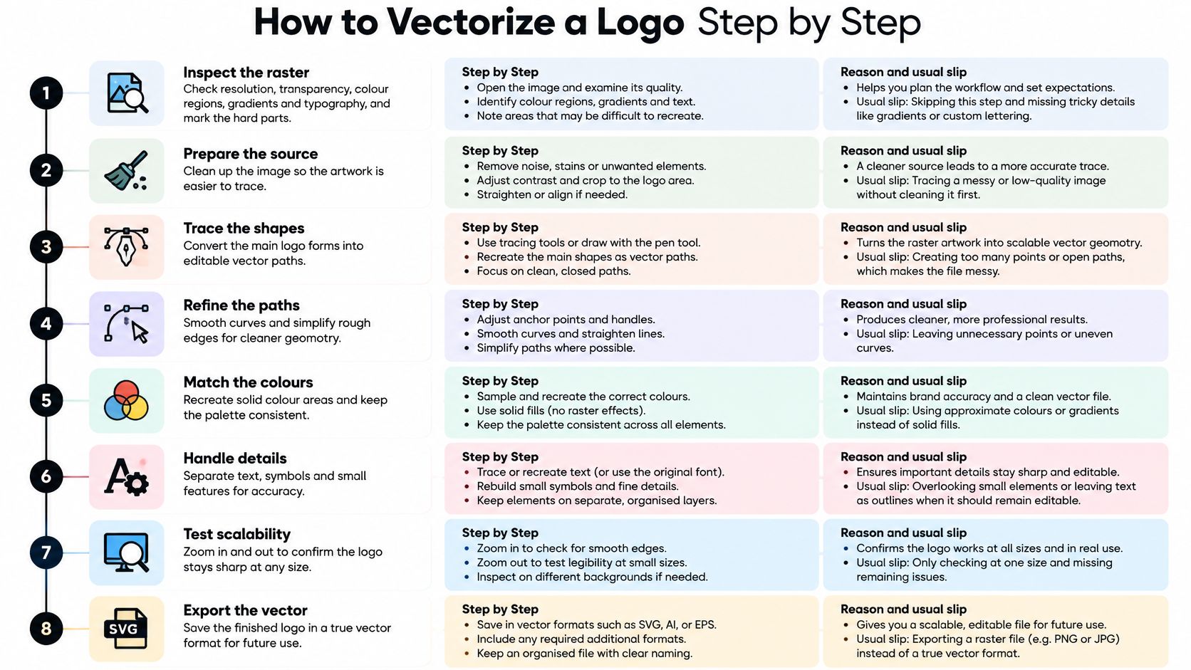
The eight steps in order
-
Inspect the raster before you touch a tool. Note resolution, transparency, colour regions, gradients and typography, and mark the parts you know will be hard. The usual slip is starting with a source that's too small. Low-resolution input produces wavy contours and redundant nodes, and cleanup can't recover detail that was never there. The PhotoQuill walkthrough for vectorizing an image puts inspection first and treats a path tolerance of about 1.5 px as a starting value for keeping node count down, not a universal setting.
-
Preprocess with thresholding or levels so the logo separates cleanly from its background. Skip this and the trace picks up paper grain, JPEG blocking and the shadow of the scanner lid.
-
Trace each distinct colour region as a closed path. Open paths break the moment you fill them or hand them to a cutting plotter.
-
Rebuild the important curves with as few Bézier anchors as possible, placing a point only where the direction changes. The math behind it is old: Pierre Bézier developed the curve mathematics at Renault in 1962, and Paul de Casteljau had derived related methods at Citroën in 1959, as Vectorwiz's history of vector graphics records. Few control points, smooth contour, easy edits. Too many anchors and every later change becomes a fight.
-
Simplify the paths and delete redundant nodes. Automatic tracing is a starting point, never a finished file, and a noisy trace can stay technically vector while visibly wrecking a smooth brand curve.
-
Convert text to outlines or embed the fonts. The SVG format lets you keep lettering as text or turn it into paths, and the paths version is what prevents font substitution on another machine, per the W3C's SVG overview.
-
Expand strokes when the logo has to scale predictably. A live 2 pt stroke can render at a different weight inside another app or a printer's RIP, which changes line relationships across the mark.
-
Validate at 200 to 400 percent zoom, then export a separate RGB SVG for screens and CMYK or Pantone assets for print. A clean master has few nodes, smooth curves and closed shapes, and you can tell by looking at the outline view.
If you'd rather start from a machine trace than a blank artboard, Recraft V4.1 SVG on Visual Sandbox returns editable vector output that still needs steps four through eight done by hand.
Redraw the Logo by Hand
Some logos never go near a converter. If the source is a phone photo of a shopfront, a fax, or a 300 pixel thumbnail, a trace just gives you a tidy copy of the noise. Auto-tracing performs badly on tiny, blurry, photographed, textured or perspective-distorted images, and it happily reproduces glare, shadows, anti-aliasing fringes and background texture as paths you then have to delete.
Here's the sequence for an assisted or full rebuild.
- Lock the raster on a layer at around 40 percent opacity and treat it as a reference, not a stencil.
- Ignore glare, shadow, compression specks and background texture deliberately.
- Draw closed paths with the pen tool, as few anchors as possible on letters, symbols and rounded marks.
- For a wordmark, find the typeface or the nearest match, reset the text, then outline only the letters you must alter.
- Rebuild odd letterforms by hand instead of accepting traced spacing and warped counters.
- Sample brand colours from an approved guide or physical swatch, never from an anti-aliased pixel edge.
- Expand strokes if a cutter or embroidery shop needs fixed shapes.
- Compare the rebuild against the source at 200 to 400 percent, then at icon size, and keep the layered file as the master.
What to keep and what to ignore
The trap on a redraw is fidelity to the wrong thing. A traced highlight on a rounded letter looks like detail until the mark sits on a van door at one color. Copy the silhouette and the spacing, not the lighting.
A clean manual reconstruction is often faster than repairing a complex automated trace. One hour of pen work beats three hours of node surgery on a file you'll never fully trust.
Colour deserves its own pass. Sampled pixels carry JPEG noise, edge blending and lighting shifts from whoever took the original photo, so brand colours should be replaced with the approved values after the shapes are done. Where the original used a gradient and the brand can live with a flat fill, take the flat fill; it prints, cuts and embroiders without a conversation.
Check the Trace Is Truly Vector
A converter hands back a file with an .svg extension that opens, looks correct on screen, and isn't vector at all. Many of them embed the original bitmap inside the SVG using an image element, so the artwork still has a fixed pixel grid and will blur the moment someone enlarges it. ShapeToVector's guide to vectorizing a logo flags exactly this, and the failure only shows up at production size.
The fix is inspection, not trust. Open the file in a vector editor and look at the object structure.
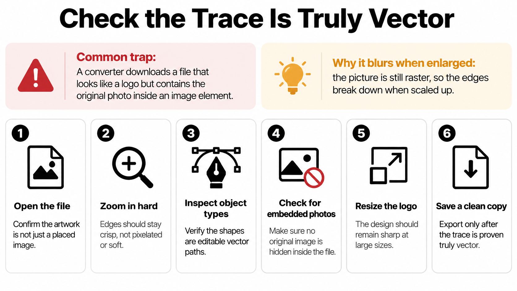
The checklist before you send anything
- No embedded raster objects. If you see one image layer and nothing else, you have a wrapped bitmap.
- Closed paths only. Open contours drop their fill or cut as a line rather than a shape.
- No stray specks. Small islands from compression noise show up as dots on embroidery and laser beds.
- Overlaps merged. Unite shapes that should read as one, and check path direction so counters punch out instead of filling in.
- Correct test at output size. A logo that looks fine at 800 px can lose thin strokes at 20 mm.
Even a vector trace isn't automatically production-ready. Thin strokes, letter counters, overlaps and negative space can shift when the file moves between SVG, EPS, PDF and cutting formats, so the sequence is convert, inspect, simplify, then test at the size it will be made. Signage, packaging, embroidery, laser cutting and large-format print are where hidden raster content fails first, because those processes enlarge the mark far beyond any screen preview.
Here's a short walkthrough of the same inspection process on a real file.
Export the Right Format for Each Use
A high-resolution PNG is not a vector master. It looks sharp at the one size you exported it, and its dimensions stay tied to a pixel grid. An SVG stores the shapes and styling instructions instead, so browsers and design systems can render the same file at different scales. The W3C published SVG 1.0 as a Recommendation on 4 September 2001, after working drafts from February 1999, and it has been the reason a logo can live on a watch face and a billboard from one file ever since, according to the W3C's SVG standards history.
Keeping one file for every use is the mistake. Match the export to the output.
| Use case | Format | Why it matters |
|---|---|---|
| Websites, apps and responsive layouts | SVG | Scales without pixelation in browsers |
| Editable master for future changes | AI or EPS | Keeps paths, layers and outlined type editable |
| Commercial print from a printer | PDF or EPS with CMYK and Pantone values | Printers need colour definitions and bleed handling |
| Signage, embroidery or cutting | Format the vendor specifies | Each shop sets its own file rules |
| Small icons and profile images | SVG plus PNG at exact pixel size | Pixel-aligned edges stay sharp at small sizes |
What printers and vendors actually need
SVG is not an ideal sole handoff for commercial print. It lacks native CMYK, bleed and crop marks, so colour values and bleed have to be defined in the print file itself. Beyond colour, excess anchor points inflate the SVG payload, make editing slow and can slow rendering, which matters when a logo sits in a site header on every page, per BytePlus's notes on vector quality control.
Embroidery adds a layer of its own. A vector file is the starting point, not the finished job, because digitizing decides stitch order, density and how small lettering can go, and Dirt Cheap Headwear's explanation of vector files for embroidery covers why the format you send isn't the file the machine runs.
The pairing rule: RGB for screens, CMYK with Pantone references for print. Ship both, plus an editable master with outlined type so nothing substitutes on another machine.
Two small habits save reprints. For icons and profile images, align critical horizontal and vertical edges to the pixel grid, since a one-pixel offset reads as blur at 32 px. And when you're prepping any raster asset for a print handoff, the same discipline applies to generated images, as this guide to making an AI image print ready sets out. Favour clean curves over tracing every nick in the original; nobody sees the nick at sign scale, and everybody sees a lumpy curve.
Visual Sandbox runs vector models such as Recraft Vectorize and Quiver Arrow 2 next to image, video, audio and 3D generation in one workspace, so a fuzzy logo can go in and editable SVG paths can come out, ready for cleanup in Illustrator, Figma or Inkscape. Every run draws on the same credit balance, and the price shows before you generate, which makes it cheap to test a bad source and see how much of the trace the model handles. Take your worst file to Visual Sandbox and compare the output against the eight steps, then finish the curves by hand.