Skateboard Graphics
- skate deck art
- street graphics
- Powell Peralta style
A cartoon or a logo pushed to the edge of taste, screened flat on a coloured ground.
Opens an image model with the prompt in it. The price is on the page before you sign in.
What it is for
Skate graphics have to work upside down, at speed, and getting scratched off. That forces a bold emblem and nothing else, which is exactly what a poster wants.
The irreverence is the other half. Skate art has always sat just outside what a parent would approve of, and that edge is what the audience is buying.
How it works
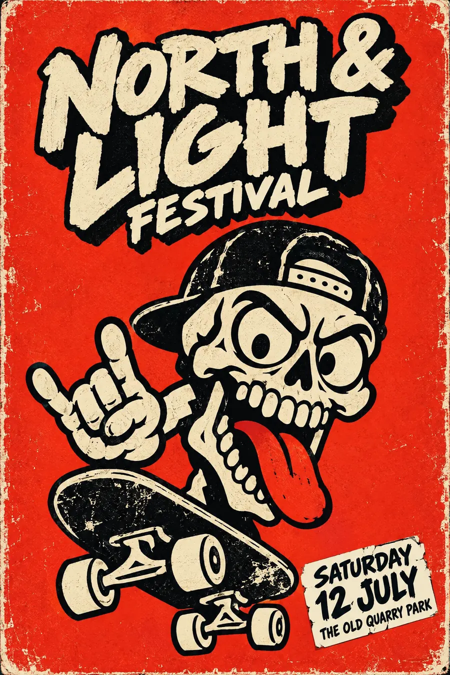
One bold emblem or cartoon, screened in three flat colours on a strong coloured ground. No gradients and no photography.
Thick confident black outlines around everything, with an exaggerated expression on any character.
Draw the logotype by hand with a heavy outline and a hard offset shadow. Slap the small text on as a sticker at an angle, and add scuffed edges and griptape texture.
When to use it
Use it for a skate event, a youth project, a punk or hardcore gig, a bike jam, a street food market, a clothing launch.
Leave it alone for anything corporate. The style is built to look unapproved.
Told apart from its neighbours
Graffiti is sprayed on a wall and letterform led. Skate graphics are screened flat and emblem led.
Pop art is commercial imagery made fine art. Skate graphics are fine art technique made commercial again.
Punk flyers are photocopied and torn. Skate decks are printed properly, then worn out by use.
Where it was used
Vernon Courtlandt Johnson drew the Powell Peralta skull and sword and the Ripper in the early 1980s, and Jim Phillips drew the Santa Cruz Screaming Hand in 1985. Both are still printed on everything four decades later.
- Powell Peralta
- Jim Phillips at Santa Cruz
- Vernon Courtlandt Johnson
The prompt
Replace the blanks with your own event, keep the rest. Then run it on an image model.
poster for <event>, skateboard deck graphic, one bold irreverent cartoon or emblem screened in three flat colours on a strong coloured ground, thick confident black outlines, a skull or a mascot with an exaggerated expression, a hand-drawn logotype with a heavy outline and a hard offset shadow, small text set as a sticker slapped at an angle, worn scuffed edges and griptape texture, high contrast with no gradients, <date, time and place> on a small sticker element
What goes wrong
The model returns a soft illustration. Ask for three flat screened colours on a strong coloured ground with thick black outlines and no gradients.
The second failure is a polished finish. Say the edges are scuffed and worn with griptape texture.
Leave out
subtlety, gradients, photographic imagery, thin lines, corporate restraint
Watch for
Three flat colours on a coloured ground. The deck was screened, so nothing blends.
Questions
Print it
Pay for the one run. No subscription, and the price is on the model page before you sign in.