Factory Records
- Peter Saville style
- Hacienda poster
- Manchester design
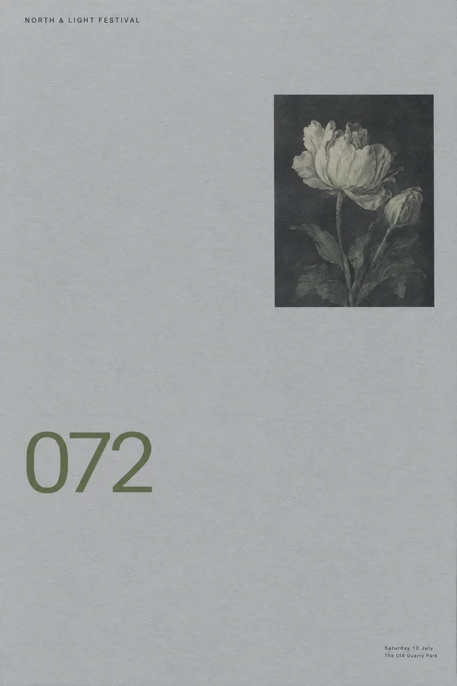
Almost no information, borrowed classical or industrial imagery, and a catalogue number.
Opens an image model with the prompt in it. The price is on the page before you sign in.
What it is for
Factory treated the audience as people who would work it out, and the refusal to explain is what made the label feel like a members club you could join by paying attention.
It also proves how little a poster needs. A borrowed image and a catalogue number carried a decade of Manchester music.
How it works
Take one image from somewhere else and use it without explanation: a classical still life, an industrial warning stripe, a data plot, a colour chart.
Set the type tiny, in a corner, with a great deal of space around it. The catalogue number can be larger than the event name.
Cool restrained palette, grey and black with one muted colour. Swiss precision in the alignment, on matte uncoated stock.
When to use it
Use it for a club night, a gallery, an electronic gig, a design event, a record launch, an anniversary.
Leave it alone when people genuinely need the information. The style hides it on purpose.
Told apart from its neighbours
Swiss Style withholds decoration but not information. Factory withholds both.
4AD is the other great label house style, but it is atmospheric and photographic rather than austere and borrowed.
Japanese minimal empties the sheet for calm. Factory empties it for mystery.
Where it was used
Peter Saville designed for Factory from 1978, numbering everything including the Hacienda, which was FAC 51, and a lawsuit. Unknown Pleasures in 1979 put a pulsar plot on a black sleeve with no words on the front at all.
- Peter Saville
- Unknown Pleasures
- the Hacienda
The prompt
Replace the blanks with your own event, keep the rest. Then run it on an image model.
poster for <event>, Factory Records design in the manner of Peter Saville, austere and almost empty, one borrowed image such as a classical floral still life or an industrial hazard stripe used with no explanation, cool restrained palette of grey black and one muted colour, tiny type set in a corner with enormous space around it, the band name barely present or absent, a catalogue number set larger than the title, precise Swiss alignment, matte uncoated stock, <date, time and place> in very small type at one edge
What goes wrong
The model makes the title large and clear. Ask for tiny type in a corner with enormous space around it and a catalogue number set larger than the title.
The second failure is an explanatory image. Say the image is borrowed and used with no explanation.
Leave out
photographs of the band, large type, warmth, decoration, obvious hierarchy
Watch for
Withholding information is the design. Making it clear ruins it.
Questions
Print it
Pay for the one run. No subscription, and the price is on the model page before you sign in.
Next to it in labels and bills