Festival Indie Lineup
- lineup poster
- festival bill
- Glastonbury style
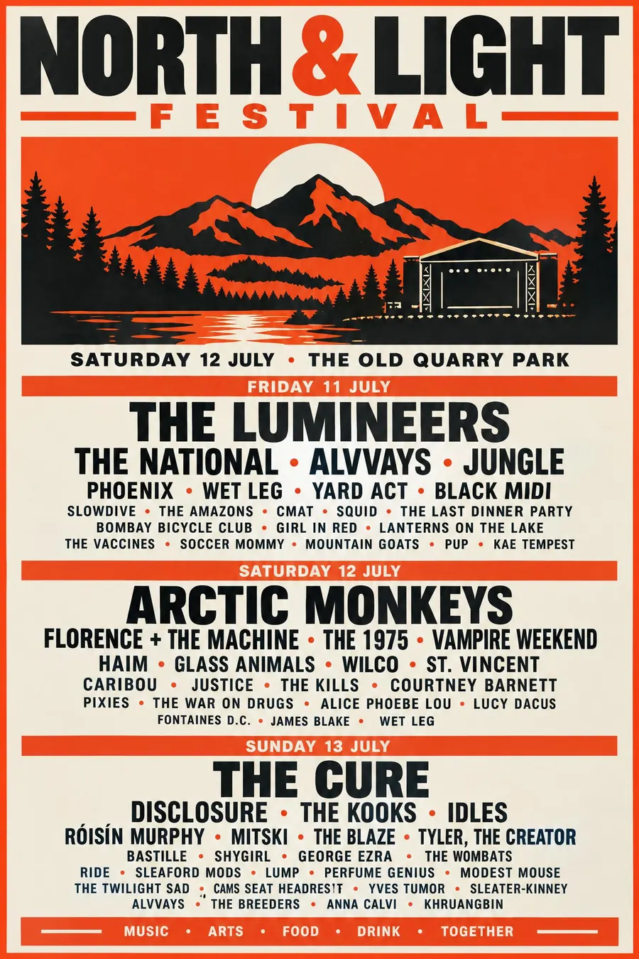
One central graphic, then the whole bill stacked underneath in strict size order.
Opens an image model with the prompt in it. The price is on the page before you sign in.
What it is for
The lineup block is one of the few genuinely modern poster formats, and it solves a real problem: rank forty names by importance and still make it readable.
It also flatters an event. A stacked bill implies more is happening than a list of five bullet points ever could.
How it works
One strong central graphic in the upper half. It carries the identity, and the type carries everything else.
Stack the lineup beneath in justified lines, flush to both edges. Headliners very large, then each tier smaller, with small bullet dots between names on a line.
Give each day its own block with a coloured heading. Put a sponsor strip along the very bottom. Two colours plus black.
When to use it
Use it for a festival, a multi-act gig, a conference with many speakers, a fete with many stalls, a season programme, a comedy bill.
Leave it alone when there are fewer than about eight names. The format needs a crowd.
Told apart from its neighbours
A Victorian broadside is the ancestor and uses a different typeface per line rather than one face at descending sizes.
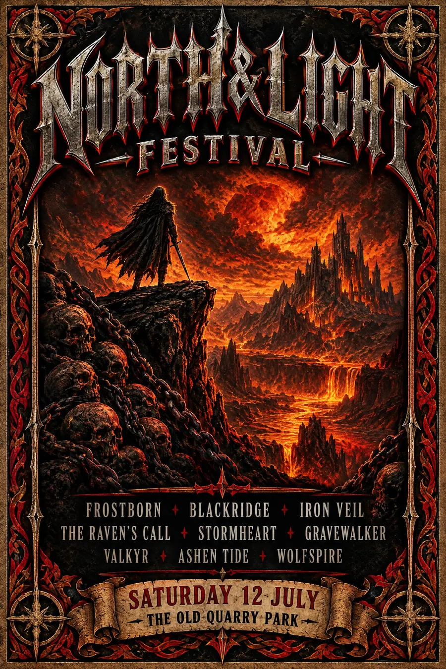
Heavy metal posters centre an illustration and keep the bill small.
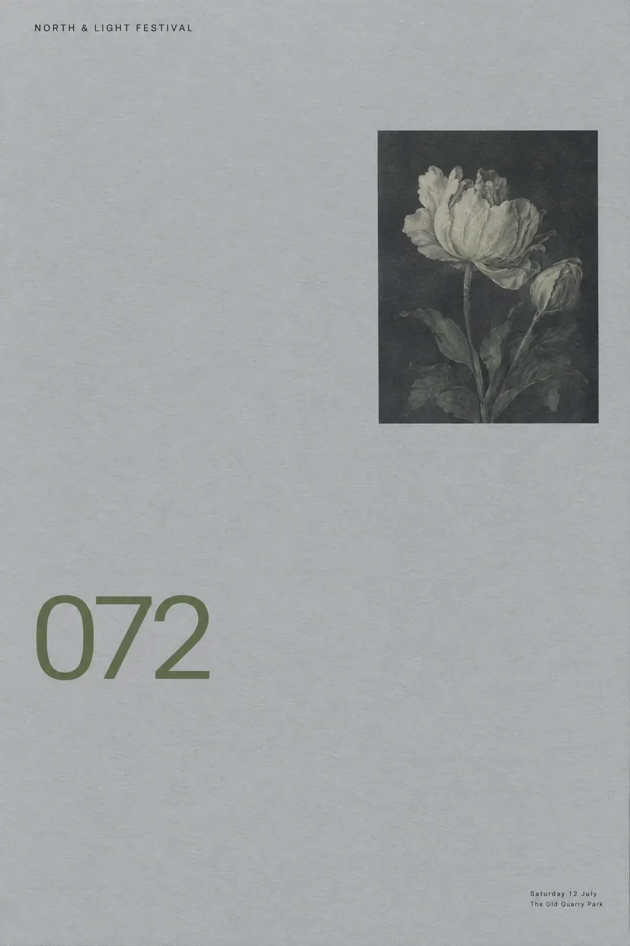
Contemporary editorial gives the headline the sheet and has nowhere to put forty names.
Where it was used
Glastonbury, Reading and Coachella all use the same structure, and the format has become strong enough that people parody it with shopping lists and cabinet ministers. Primavera Sound's version, with every name at nearly the same size, is the deliberate counter-argument.
- Glastonbury
- Primavera Sound
- Coachella
The prompt
Replace the blanks with your own event, keep the rest. Then run it on an image model.
poster for <event>, contemporary indie festival lineup poster, one strong central graphic or illustration filling the upper half, the full lineup stacked beneath it in tightly justified lines with the headliners very large and every later name smaller, names separated by small bullet dots, each day given its own block with a coloured day heading, a sponsor strip along the very bottom, a confident palette of two colours plus black, <date, time and place> set directly under the title
What goes wrong
The model returns a ragged centred list. Ask for justified lines flush to both edges with names separated by small bullet dots.
The second failure is uniform sizing. Say the headliners are very large and each later tier is smaller.
Leave out
empty space in the lineup block, ragged edges, decorative script, uneven columns
Watch for
Every lineup line must justify edge to edge. That flush block is what makes it read as a festival bill.
Questions
Print it
Pay for the one run. No subscription, and the price is on the model page before you sign in.
Next to it in labels and bills