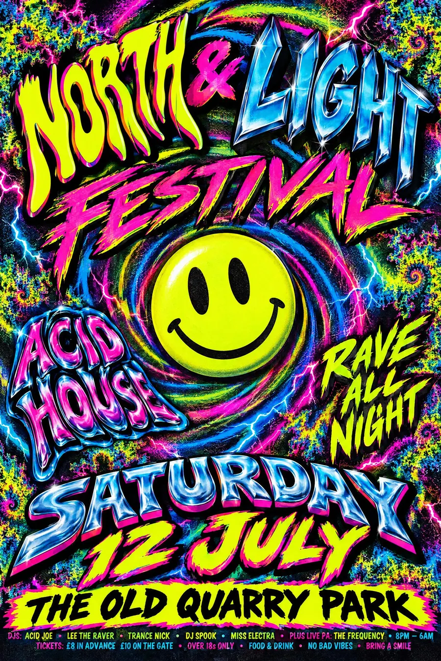
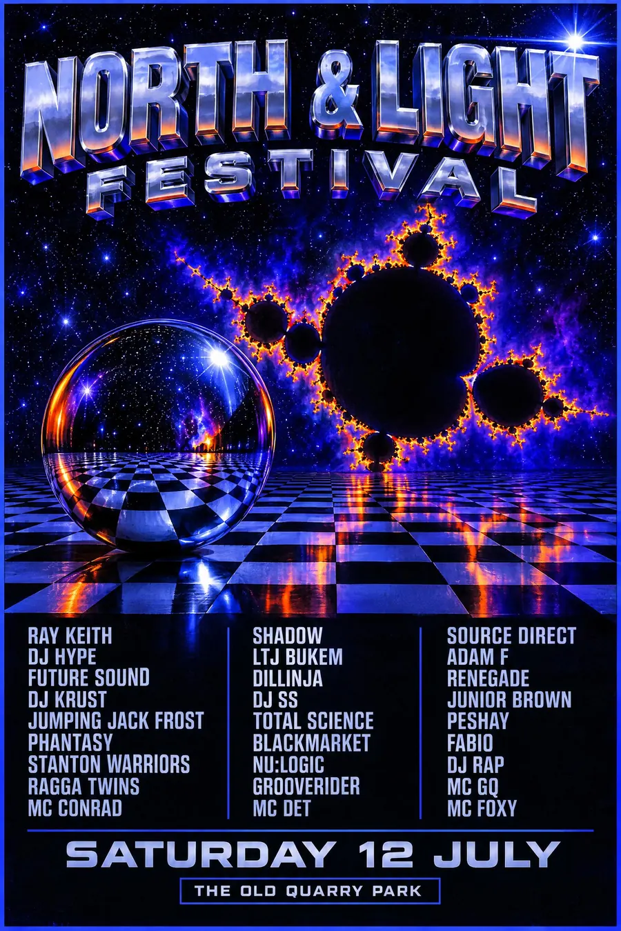
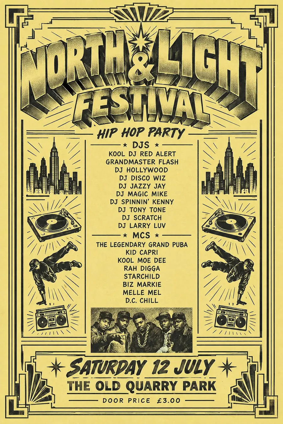
Reggae Sound System Flyer
- dancehall flyer
- sound clash poster
- blues dance flyer
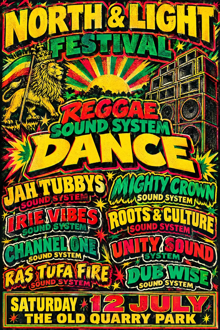
Red gold and green, a lion, and every sound system named in a different typeface.
Opens an image model with the prompt in it. The price is on the page before you sign in.
What it is for
A sound system flyer is a bill of combatants. The typeface a sound gets is its identity, so the sheet has to carry several competing identities at once.
The result is the loudest typographic tradition after the Victorian broadside, and it comes with the best palette in this catalogue.
How it works
Red, gold and green on black, with a lion of Judah, a rising sun or a Star of David as the central motif.
Set each sound system name in a different bold display face, each with a heavy outline and a drop shadow, sized by billing.
Draw a speaker stack in perspective and set the word DANCE very large. Print cheaply, with heavy ink and slight misregistration, and fill the sheet.
When to use it
Use it for a reggae or dancehall night, a carnival event, a Caribbean food festival, a record fair, a community party, a sound clash.
Leave it alone when the event has nothing to do with the culture. This is a living tradition, not a texture.
Told apart from its neighbours
Hip hop flyers from New York are black and white photocopies with airbrush lettering. These are full colour and printed.
Victorian broadsides share the every-line-a-different-face logic in black and white.
Heavy metal posters centre one image rather than balancing several names.
Where it was used
Jamaican dancehall flyers from the 1970s onward and the London blues dance posters that followed the Windrush generation are the tradition. Sound clash bills, with two or four systems named against each other, are the purest form.
- Jamaican dancehall flyers
- London blues dance posters
- sound clash bills
The prompt
Replace the blanks with your own event, keep the rest. Then run it on an image model.
poster for <event>, reggae sound system dance flyer, Rastafarian red gold and green on black, a lion of Judah and a rising sun motif, every sound system name set in a different bold display typeface with a heavy outline and drop shadow, a speaker stack drawn in perspective, hand-drawn starbursts and the word DANCE set very large, cheap offset print with heavy ink and slight misregistration, crowded layout with no empty space, <date, time and place> in a bordered box at the foot
What goes wrong
The model sets everything in one typeface. Say every sound system name uses a different bold display face with an outline and a drop shadow.
The second failure is a clean layout. Ask for a crowded sheet with heavy ink and slight misregistration.
Leave out
restraint, muted colour, a single typeface, empty space, minimal layout
Watch for
Each sound system gets its own typeface. That is how the bill shows who is clashing whom.
Questions
Print it
Pay for the one run. No subscription, and the price is on the model page before you sign in.
Next to it in flyers printed for one night