Rave and Acid Graphics
- acid house flyer
- 90s rave flyer
- smiley graphics
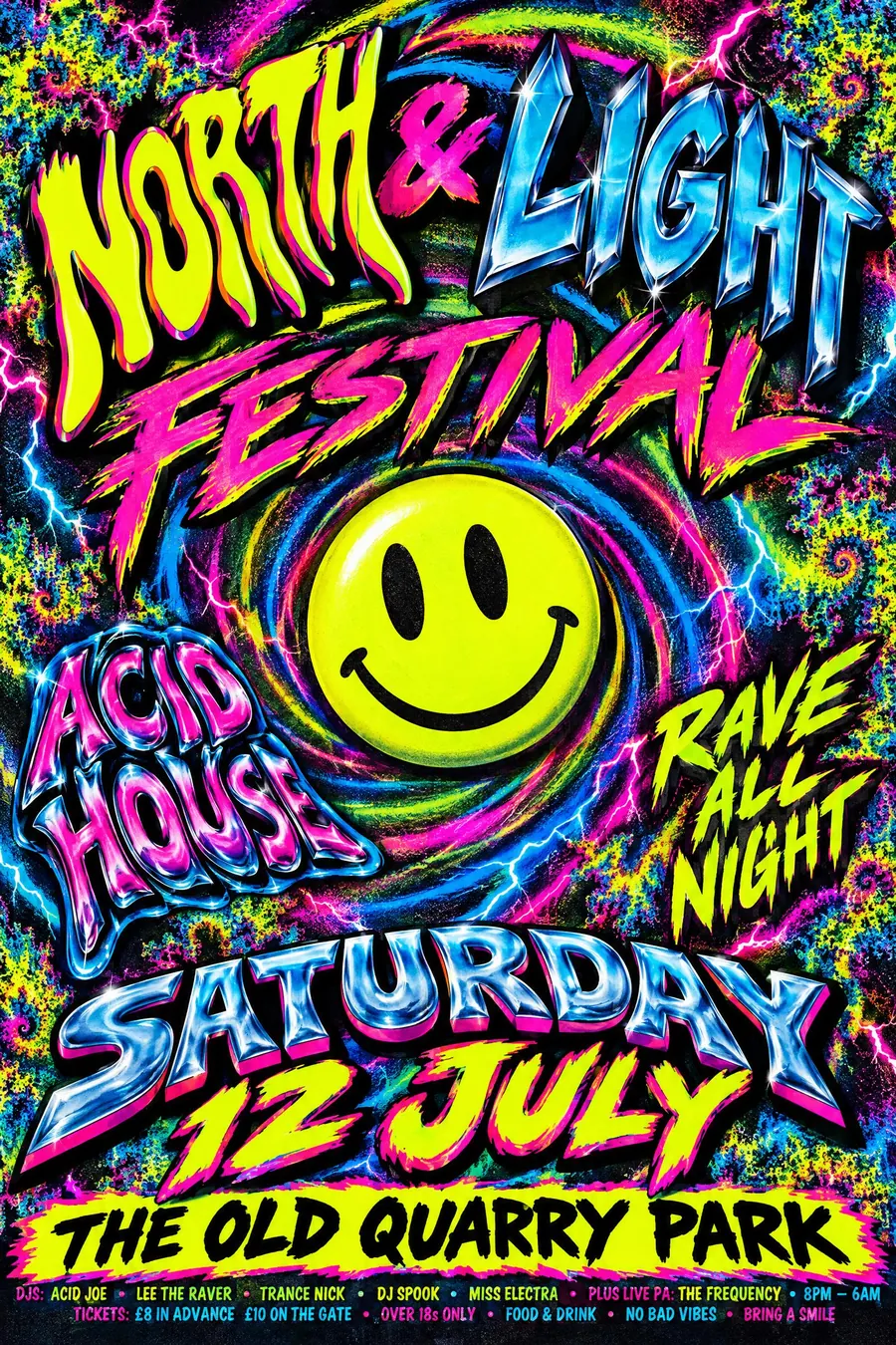
Neon on black, a smiley, warped type and every effect the software had.
Opens an image model with the prompt in it. The price is on the page before you sign in.
What it is for
Rave flyers were made by people with a new computer and no design training, and the joy of that shows. Every effect in the menu is on the sheet because every effect was new.
They also had to work in a dark room and in somebody's pocket, so the neon on black is functional as well as loud.
How it works
Neon on black. Acid yellow, magenta and cyan, at full saturation, with nothing muted.
Warp the type: stretch it, bevel it in chrome, throw a hard drop shadow behind it, and use four or five typefaces at once with no hierarchy.
Add the period furniture: a smiley, airbrushed lightning, a fractal, a spiral vortex background. Cram the small print along the bottom edge on cheap glossy A5 card.
When to use it
Use it for a 90s night, a rave revival, a club night, a student event, a warehouse party, a fundraiser with a dance floor.
Leave it alone when the audience is general. It reads as chaos to anybody outside the reference.
Told apart from its neighbours
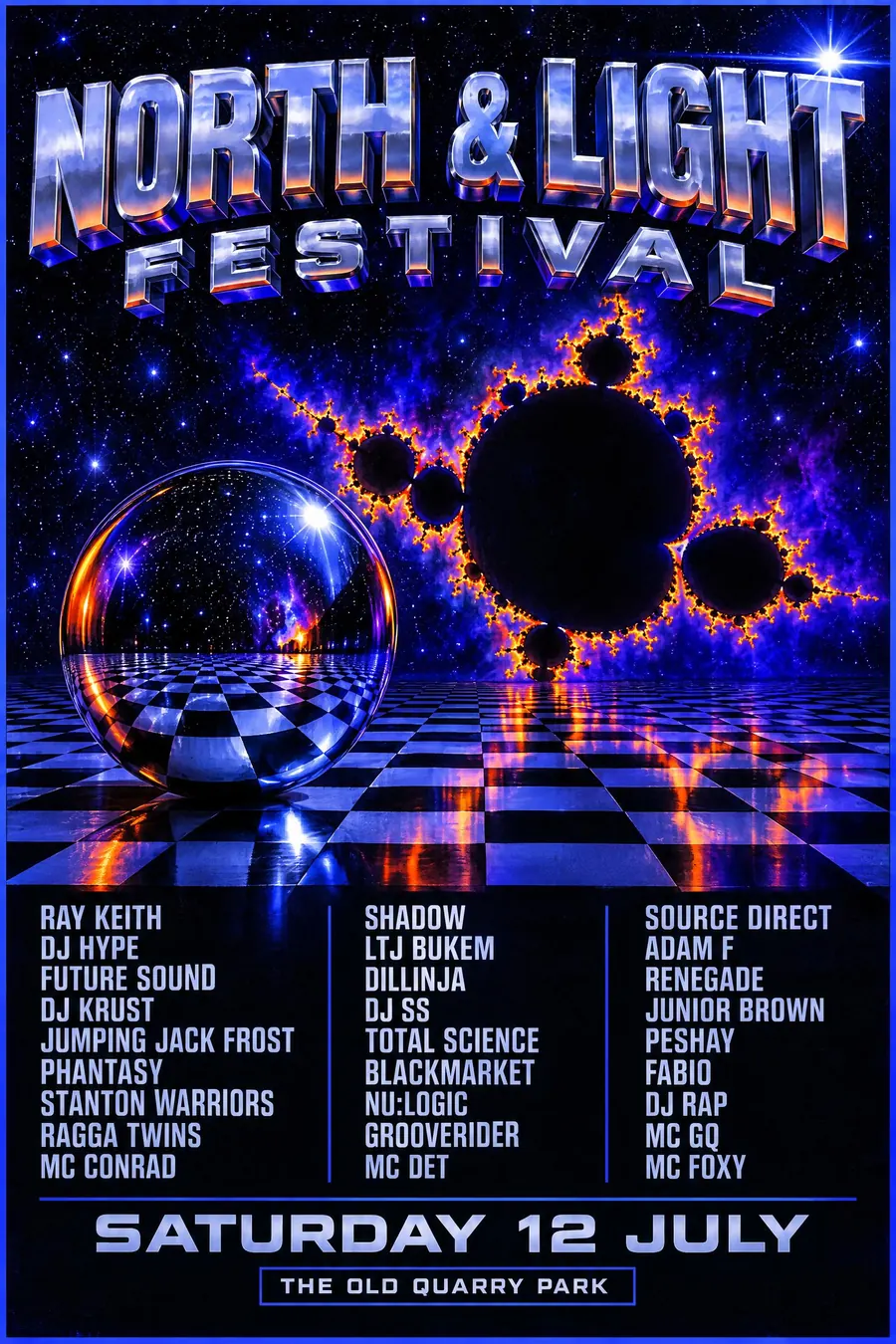
Drum and bass flyers from the same decade are darker, sharper and built on 3D and fractals rather than smileys.
Y2K chrome is later, cleaner and more corporate, with liquid metal instead of neon.
Vaporwave is a modern reconstruction of the same period, and is calm where this is frantic.
- 90s Drum and Bass Flyer
- Y2K Chrome
- Memphis
- Vaporwave
Where it was used
Fantazia, Raindance and Dreamscape printed hundreds of thousands of these between 1989 and 1994, handed out in car parks and record shops. The Museum of Youth Culture and the Flyer Archive have since collected them properly.
- Fantazia
- Raindance
- early Ministry of Sound flyers
The prompt
Replace the blanks with your own event, keep the rest. Then run it on an image model.
poster for <event>, early 1990s rave flyer, screaming neon on black in acid yellow magenta and cyan, an acid house smiley face, type warped and stretched with a chrome bevel and a hard drop shadow, airbrushed fractal and lightning elements, a spiral or vortex background, five different typefaces used at once with no hierarchy, small print crammed along the bottom edge, glossy cheap print on A5 card, <date, time and place> crammed into a neon strip at the foot
What goes wrong
The model returns a tidy neon poster. Ask for four or five typefaces at once with no hierarchy, warped and bevelled, with a hard drop shadow.
The second failure is empty space. Say the sheet is full and the small print is crammed along the bottom edge.
Leave out
restraint, white space, muted colour, a single typeface, alignment
Watch for
Excess is the style. A tasteful rave flyer is a contradiction and reads as a modern pastiche.
Questions
Print it
Pay for the one run. No subscription, and the price is on the model page before you sign in.
Next to it in flyers printed for one night