WPA New Deal
- Federal Art Project
- 1930s WPA poster
- national parks poster
Bold flat silkscreen shapes, a confident diagonal, and a short instruction in friendly capitals.
Opens an image model with the prompt in it. The price is on the page before you sign in.
What it is for
The WPA posters were public information made by out-of-work artists, so they combine real craft with a plain civic purpose. Nothing in them is trying to be clever.
That plainness is why they still read well. A bold shape, a short instruction and four colours works for a fete as well as it worked for a milk campaign.
How it works
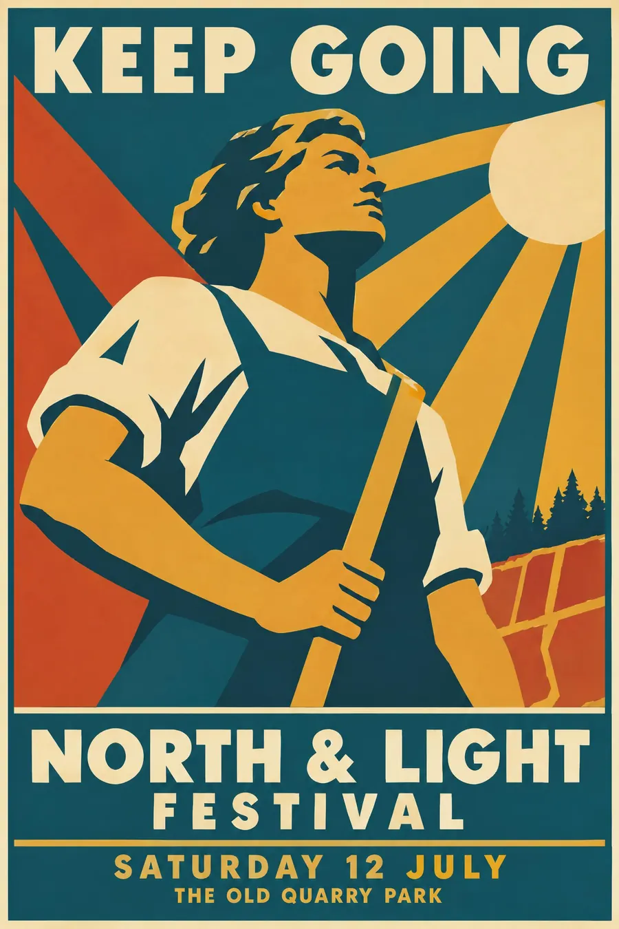
Screenprint logic: four or five flat spot colours, no blends, shadows as solid flat shapes rather than shading.
Simplify the subject and shoot it from a low angle so it reads as monumental. Run a strong diagonal through the composition.
Warm palette of teal, ochre, brick and cream. Friendly geometric sans capitals in a solid band, a thin keyline border, and a headline of two or three words at most.
When to use it
Use it for a park event, a library, a public health campaign, a museum, a community project, a walking festival, a school.
Leave it alone for anything commercial or ironic. The style is sincere and it does not wink.
Told apart from its neighbours
Golden age travel posters are airbrushed and sell a view. WPA posters are screenprinted and give an instruction.
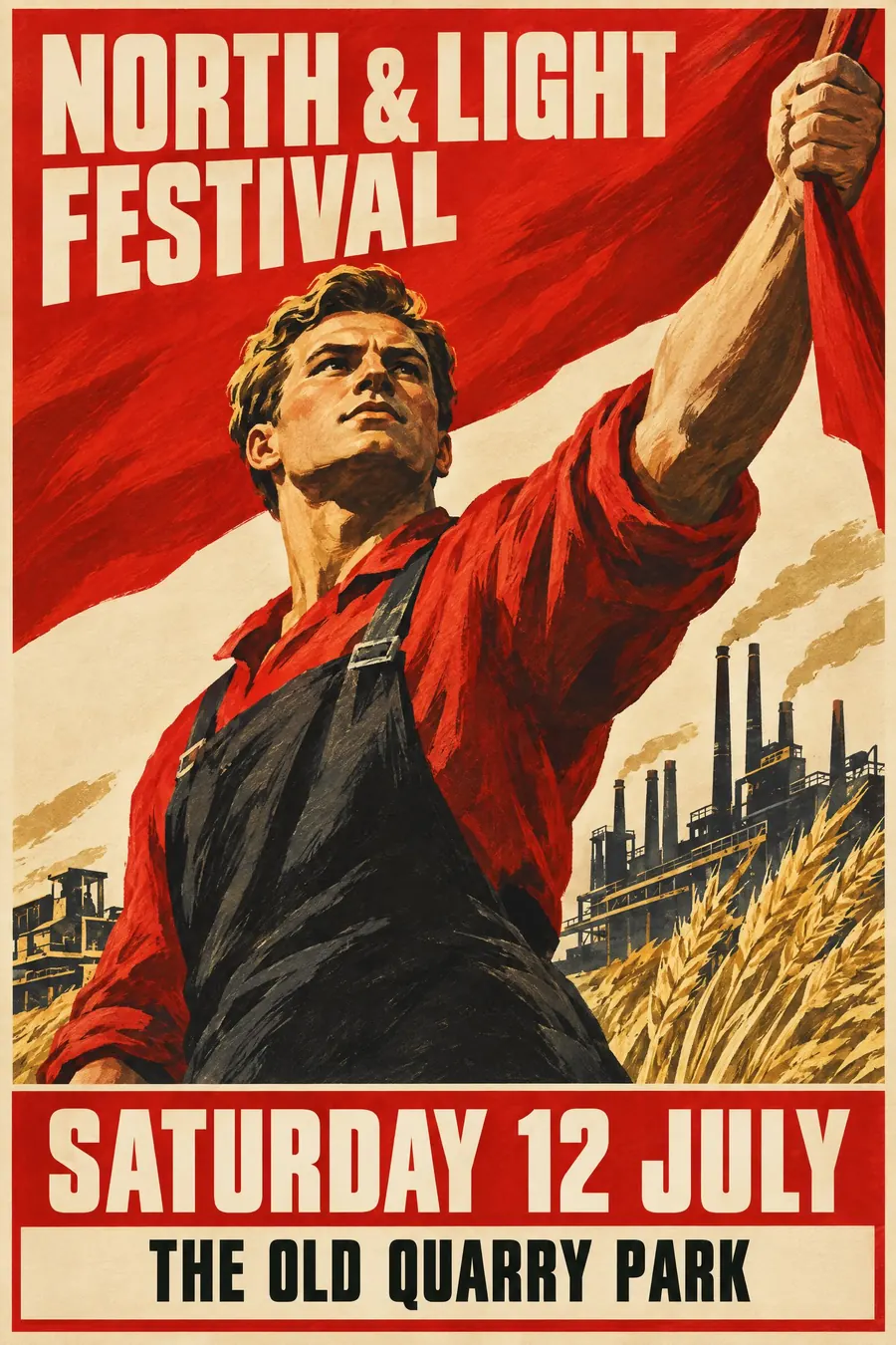
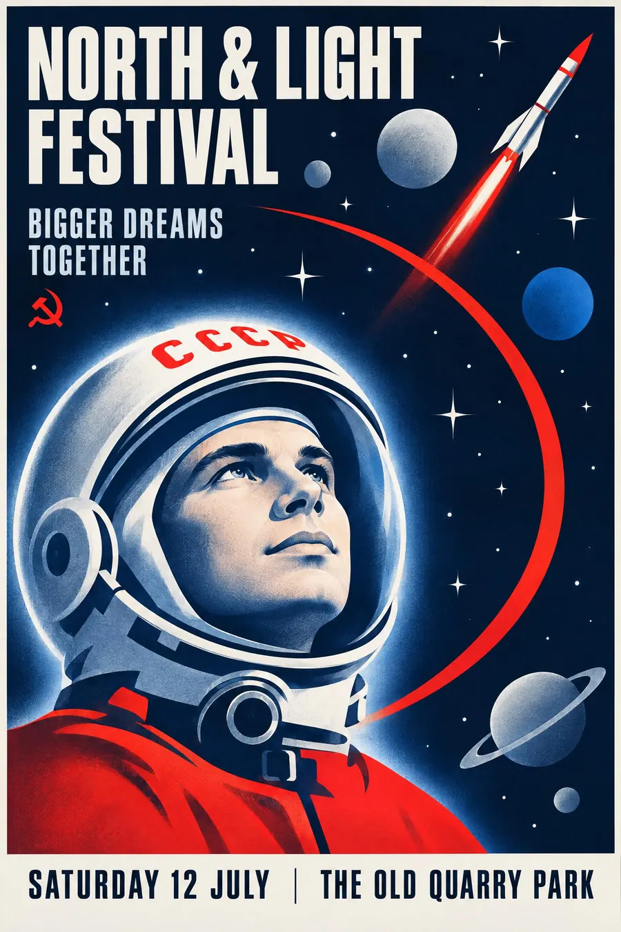
Soviet propaganda is rhetorical and heroic about a struggle. WPA is calm and civic.
Screenprint pop is the same process without the public-information voice.
Where it was used
The Federal Art Project produced around two million posters between 1935 and 1943, of which roughly two thousand survive. The national parks series is the best known, and the whole archive sits in the Library of Congress.
- Federal Art Project
- national parks posters
- Works Progress Administration
The prompt
Replace the blanks with your own event, keep the rest. Then run it on an image model.
poster for <event>, 1930s WPA Federal Art Project silkscreen, four or five flat spot colours with no blends, bold simplified shapes with a strong diagonal composition, a single heroic subject seen from a low angle, deep shadow areas as solid flat colour, warm palette of teal ochre brick and cream, friendly geometric sans capitals in a solid band, a thin keyline border, a short two-word instruction as the headline, <date, time and place> in a small block at the base
What goes wrong
The model returns a detailed illustration. Ask for four or five flat spot colours with no blends and shadows as solid flat shapes.
The second failure is a long headline. Say the headline is two or three words at most, in friendly geometric sans capitals.
Leave out
photographic detail, gradients, clutter, thin decorative type, pastel colour
Watch for
Two-word headline. WPA posters told you to do one thing, and the brevity is half the look.
Questions
Print it
Pay for the one run. No subscription, and the price is on the model page before you sign in.
Next to it in printed by the state